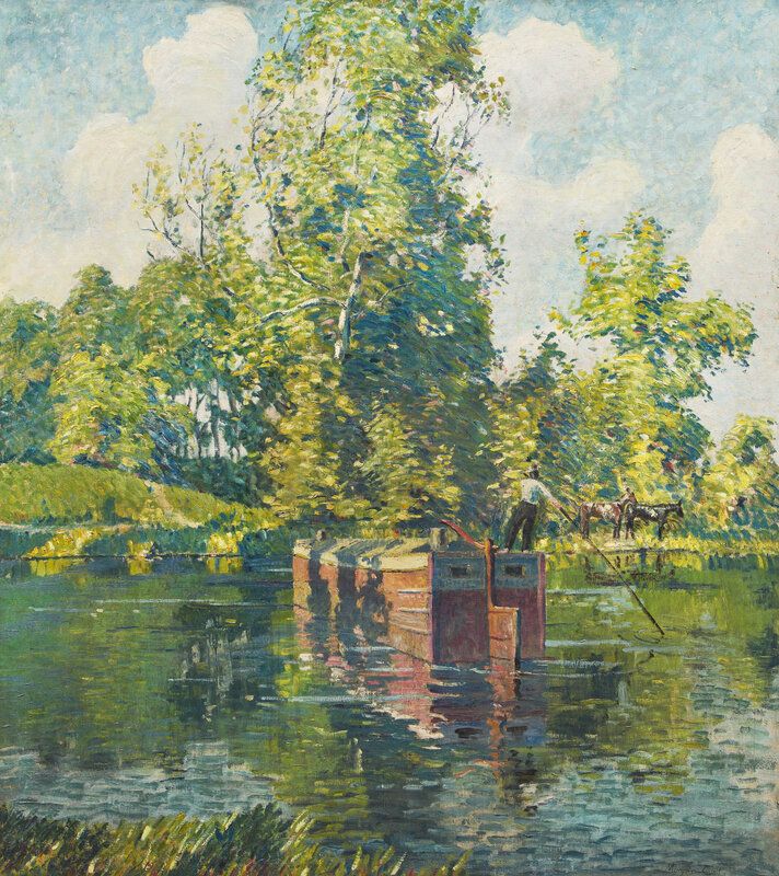
New & Noteworthy
Stay up to date with news, highlights, & features from across Freeman's.
Stay up to date with news, highlights, & features from across Freeman's.
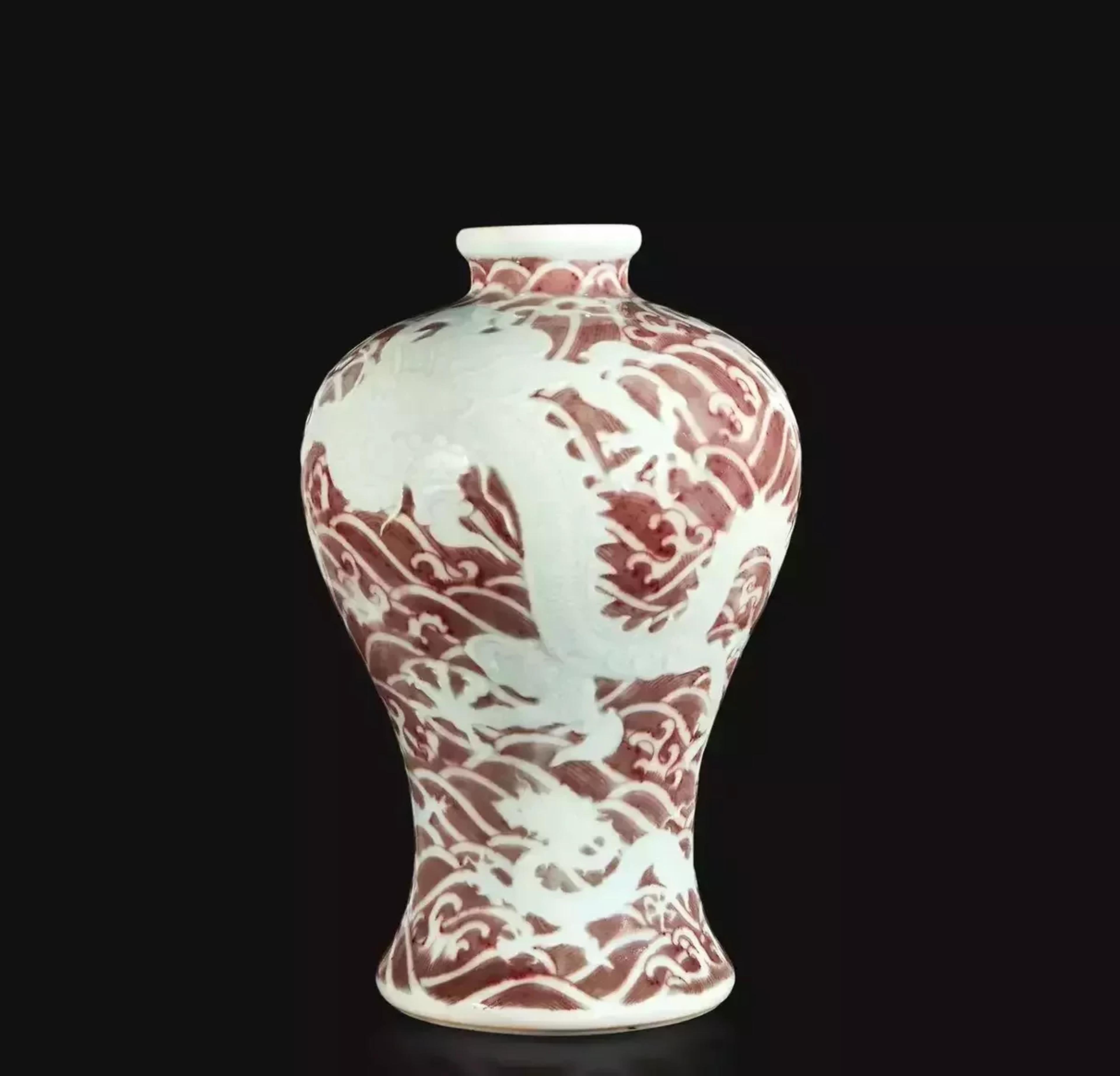
Success For Freeman’s Biannual Asian Arts Auction Freeman’s April 2021 Asian Arts auction featured lively bidding wars between online and phone buyers, resulting in many lots selling well above their pre-sale estimates, realizing $3.7 million in total with a sell-through rate of 91%. The highlight of the 138-lot auction was the sale of a red-underglaze Meiping “Dragons and Waves” vase, which realized an impressive $2.3 million, far surpassing its pre-sale estimate of $150,000–$250,000. The vase came to auction from the collection of Sheelah M. Langan (1910–1993), and is a rare example of a small group of wares made for the Yongzheng emperor. The theme of larger and smaller dragons has been related to the saying “Canlong jiaozi,” which may be translated as “the Eastern [Blue] dragon teaching his son.” This has been understood to imply both the importance of teaching the young and also to bringing one’s descendants up to succeed in court or higher office. This would certainly have been relevant for the Yongzheng Emperor who succeeded his illustrious father, the Kangxi Emperor, and in turn was to nurture the development of his own son, the Qianlong Emperor. These three Emperors collectively reigned over what may be described as a golden age for China and the Arts. “We’re absolutely thrilled that Freeman’s was able to offer such a fine and well-curated collection of Asian art, including various porcelains, jades, and other works of art,” remarked Head of Department Ben Farina. “We were particularly delighted by the reception and performance of the Meiping dragon vase, and feel fortunate to have been entrusted with a number of heirloom collections, which were passed down through several generations.”
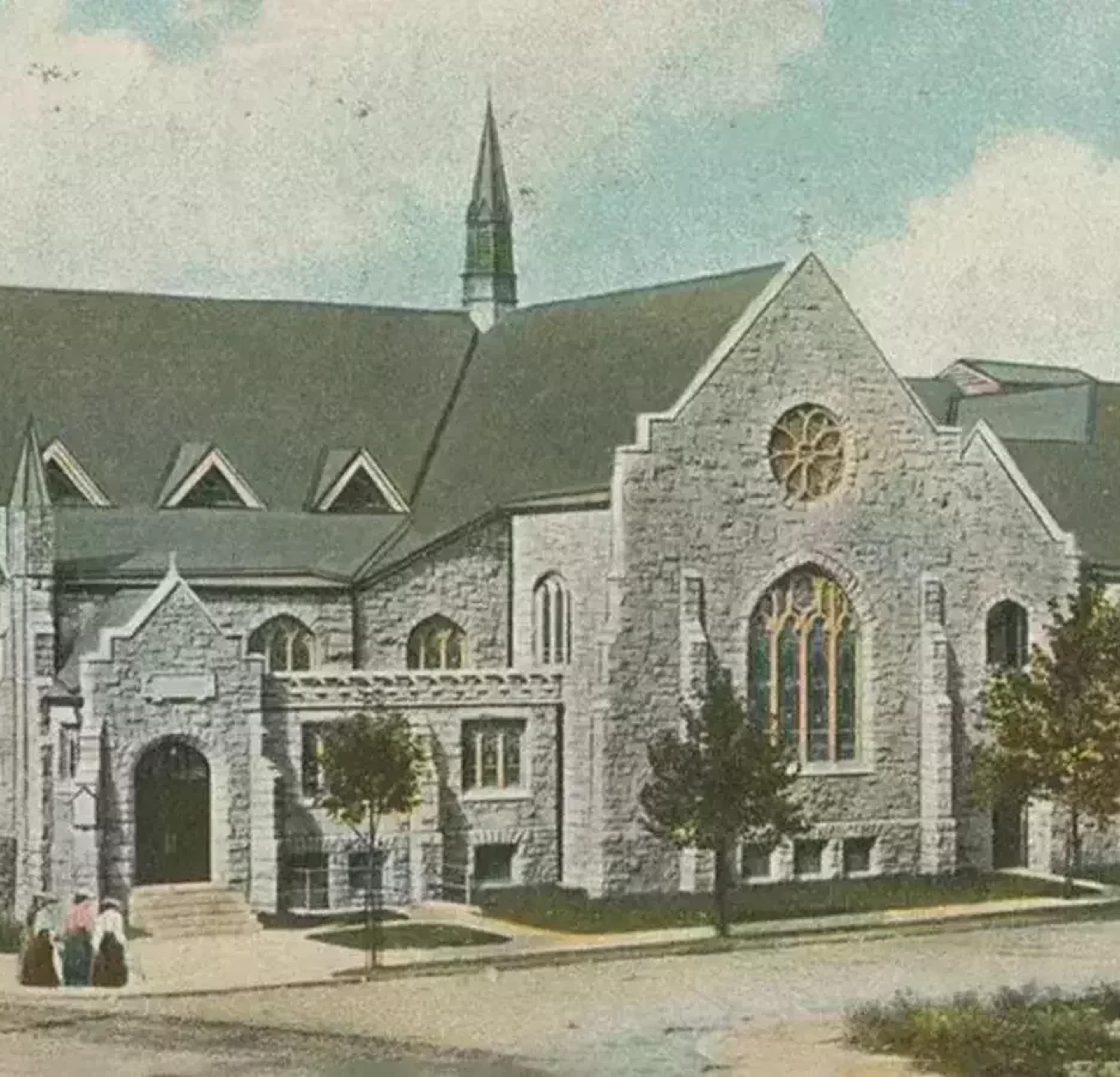
Rescued Treasures: The Magnificent Rose Windows of St. Paul's Presbyterian Church Rescued from imminent demolition, these two rose windows from St. Paul’s Presbyterian are large, complex, and unusual creations by America’s most famous art glass designer. Sited on a prominent parkside corner in the leafy streetcar suburbs of West Philadelphia, St. Paul’s Presbyterian Church bears similarities to other elaborate churches constructed during the heyday of American ecclesiastical architecture. Designed by the noted Philadelphia ecclesiastical architect Isaac Pursell in 1900, dedicated in 1901, and enlarged in 1905, St. Paul’s rusticated stone exterior was complemented by an array of leaded glass windows. Tiffany produced a variety of windows for St. Paul’s (the church is referenced in the firm’s list of window patrons published in 1910), including two stunning rose windows. The church’s Gothic Revival architecture was ennobled by the selection of these two ornamental roses. Originating with Roman oculi and Early Christian circular windows, the rose window reached its stylistic height in the 12th and 13th century cathedrals of Northern France—at Reims, Chartres, and Notre Dame de Paris. A mainstay of grand church architecture, the rose was a popular (though less frequently commissioned) window configuration offered by the Tiffany firm. The twin roses of St. Paul’s were likely commissioned around 1904 for the planned expansion and creation of an auxiliary chapel, to accommodate the affluent growing congregation and its Sunday School. The two roses were each originally set above arched tracery windows, and were located along the west and east elevations of the structure. One of the roses is inscribed “Presented by the Pansy Bible Class,” a likely reference to the church’s Sunday School, whose parents would have helped organize the associated funds for the expansion. Other prominent local Presbyterians (such as John Wanamaker, who spoke at the Church’s dedication) were also likely involved in the commission. New sources of wealth in America following the Civil War, coupled with socio-religious factors, saw the creation of new or refurbished religious edifices in the modern taste. Set high in the chapel of St. Paul’s Presbyterian, these brightly colored roses are illustrative of the aesthetic and spiritual impact Tiffany’s art in glass had on their commissioning congregations. The windows feature leaded mottled, streaky, acid-etched, and ripple glass in vibrant hues; each type of glass is employed to magnify the effect of the whole. The symbolic imagery present is minimal yet powerful: one rose is centered by a crown (representing Christ), and the other a dove (representing the Holy Spirit). When hit by the light, the layered glass reveals a cross at the center of the dove—an example of Tiffany’s ability to employ his distinct processes to heighten the emotional sensation, and deepen the meaning of his designs.
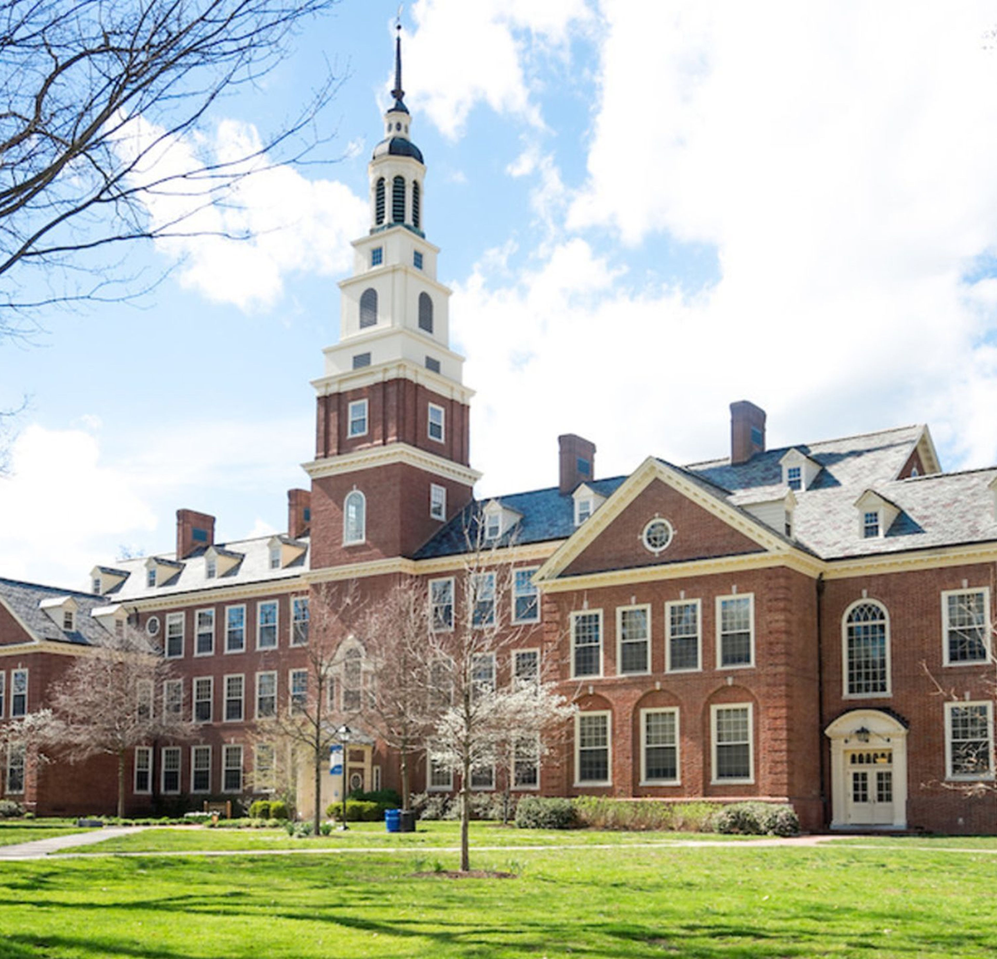
Hindman is pleased to announce the sale of Property from the Estate of Patricia Ann Black Smyth, Santa Fe, New Mexico, Sold without reserve to Benefit Berea College, Berea, Kentucky. Patricia Ann Black Smyth, born June 5, 1925 in Kansas City, MO; the daughter of the late Ernest Bateman Black and Faye Bunyan Black. She attended Miss Crosby’s School and graduated from Wellesley College in Wellesley, MA where she was a lifetime member of the Wellesley Friends of the Library Organization. She was a member of the Junior League of Kansas City, MO. Mrs. Smyth was a long-time docent at the Art Institute of Chicago. She was also a resident of Santa Fe and a major supporter of the Santa Fe Opera. Mrs. Smyth’s collecting legacy will be offered this Spring at Hindman Auctions with the proceeds to benefit Berea College, to whom Mrs. Smyth made a planned gift during her lifetime. As she resided in both Chicago and Santa Fe, her tastes spanned from European furniture and decorative arts, American made sculpture, Western motifs, chinoiserie, carved stone accessories, and many styles of décor in-between. Her collection will be included as the lead-in sessions in our upcoming European Furniture & Decorative Arts auctions, which will be taking place April 21-23, 2021. For instructions as to how to register for the auction, please visit us here at: Register at Hindman.com. Sale Information: European Furniture & Decorative Arts (865): Lots 1 – 52 Wednesday, April 21, 2021, 10:00 am CT Thursday, April 22, 2021, 10:00 am CT Click to View: April 21-22 Furniture & Decorative Arts online catalogue European Furniture & Decorative Arts (866): Lots 1000 – 1043 Friday, April 23, 2021, 10:00 am CT Click to View: April 23 Furniture & Decorative Arts Online Only catalogue A Russian Gold and Agate Bomboniere Mark of Karl Fabergé, St. Petersburg, Late 19th/Early 20th Century the body bisected with a yellow-gold band opening to a vacant interior. gold marked with ’56’ standard on interior rimHeight 1 1/2 inches. Property from the Estate of Patricia Ann Black Smyth, Santa Fe, New Mexico, Sold to Benefit Berea College, Berea, Kentucky, offered without reserve $5,000 – $7,000 A Pair of Chinese Famille Rose Porcelain Inset Hardwood Stools 20th Century each in the Ming style, the circular top inset with porcelain roundels painted to show figures in a garden setting. Height of 17 3/4 inches. Property from the Estate of Patricia Ann Black Smyth, Santa Fe, New Mexico, Sold to Benefit Berea College, Berea, Kentucky, offered without reserve Provenance: Bryan and Scott Jewelers Ltd., Colorado Springs, Colorado, 30 May 1995 $800 – $1,200 A Pair of Sèvres Style Gilt Bronze Mounted Flambe Glazed Urns Late 19th/Early 20th Century each stamped MADE IN FRANCE to the metal plate attached to the base. Height 24 inches. Property from the Estate of Patricia Ann Black Smyth, Santa Fe, New Mexico, Sold to Benefit Berea College, Berea, Kentucky, offered without reserve $400 – $600 A Louis XV Style Painted and Parcel Gilt Pier Mirror Late 19th Century Height 77 1/2 x width 50 inches. Property from the Estate of Patricia Ann Black Smyth, Santa Fe, New Mexico, Sold to Benefit Berea College, Berea, Kentucky, offered without reserve $1,000 – $2,000 An Italian Carved Cerused Wood Marble-Top Console Table Second Half 18th Century Height 34 5/8 x width 64 x depth 25 1/2 inches. Property from the Estate of Patricia Ann Black Smyth, Santa Fe, New Mexico, Sold to Benefit Berea College, Berea, Kentucky $2,000 – $3,000 A Set of Four Italian Renaissance Style Oak Side Chairs Height 34 x width 19 1/2 x depth 19 inches. Property from the Estate of Patricia Ann Black Smyth, Santa Fe, New Mexico, Sold to Benefit Berea College, Berea, Kentucky $200 – $300 A Pair of Continental Giltwood Pedestals Late 19th/Early 20th Century with marble tops. Height 52 1/4 inches. Property from the Estate of Patricia Ann Black Smyth, Santa Fe, New Mexico, Sold to Benefit Berea College, Berea, Kentucky $800 – $1,200 A. Yarnan (American, 20th Century) Circus Bear bronze signed on base and stamped Modern Art Fdry, NY on base rim Height 18 1/2 inches. Property from the Estate of Patricia Ann Black Smyth, Santa Fe, New Mexico, Sold to Benefit Berea College, Berea, Kentucky $400 – $600 Frankie Nazario Lucero (New Mexico, 20th Century) Santa Veronica, 1998 carved and painted wood signed NAZARIO 98 along the front edge of the base, further inscribed on the underside Height 20 1/2 inches. Property from the Estate of Patricia Ann Black Smyth, Santa Fe, New Mexico, Sold to Benefit Berea College, Berea, Kentucky, offered without reserve. $600 – $800
Hindman is pleased to sponsor The Heckerling Institute on Estate Planning, the nation’s premier conference for estate planning professionals. This legacy partnership is a highlight of Hindman’s programming, and this year is no different. Our Virtual Booth will be available May 3-6, 2021. As an internationally recognized leading fine-art auction house, Hindman prides itself in connecting clients to the global art market with an unyielding focus on service. Our team offers private collectors, estate professionals, and institutions a full suite of art and appraisal services including art advisory, objective recommendations, collection management, acquisition guidance, market access and insight as well as private sale opportunities and auction services. Our appraisals team is available to clients for any valuation needs, including market value, gift tax, and estate tax appraisals. Founded in 1982 and headquartered in Chicago, Hindman operates more salerooms in the United States than any other firm with 12 regional offices located in Atlanta, Cincinnati, Cleveland, Denver, Detroit, Milwaukee, Naples, Palm Beach, San Diego, Scottsdale, St. Louis and Washington D.C., giving our clients the opportunity for local as well as national relationships. We conduct over 100 auctions annually in a wide range of collecting categories such as: American Furniture, Folk & Decorative Arts Antiquities Arms, Armor & Militaria Asian Art Books & Manuscripts Clocks, Barometers & Scientific Instruments Coins, Medals & Banknotes Collectibles Couture & Luxury Accessories European Furniture & Decorative Arts Fine Art Jewelry & Timepieces Modern Design Native American, Prehistoric & Tribal Art Sports Memorabilia For over three decades, Hindman has been a trusted partner of bankers, attorneys, museums, galleries, collectors, and fiduciaries around the world by understanding and responding to their needs while achieving outstanding sales results. Click here to learn more about the full suite of offerings available. For all estate and appraisal services, please email heckerling@hindmanauctions.com.
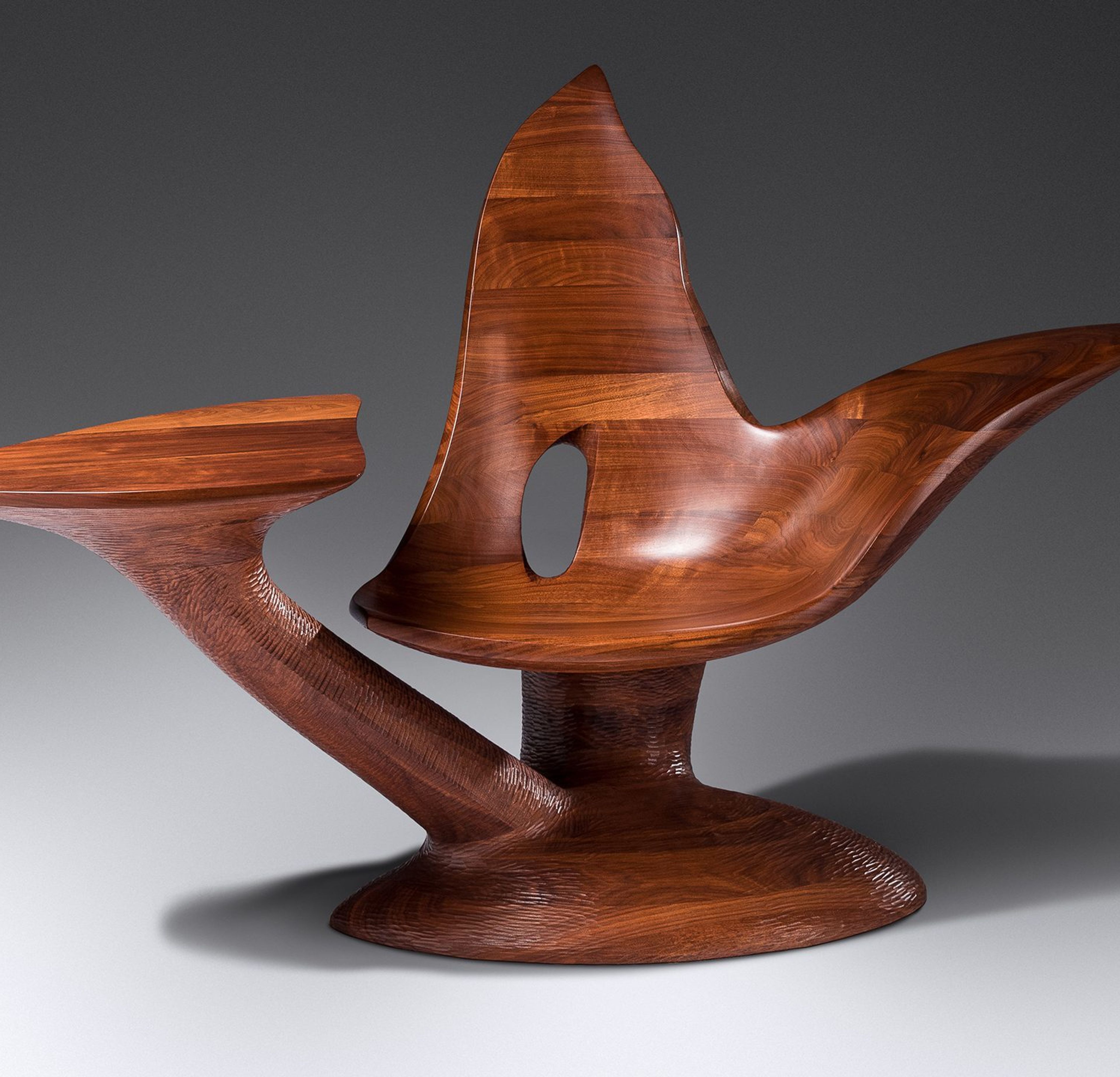
In Too Soon, Castle returns to his monumental stack lamination forms of the 1960s and 1970s while subverting a “back-to-basics” approach. During the last decade of his career, Castle synthesized his material knowledge of carving, finishing, and metal casting with newly available digital technologies of 3D scanning and CNC milling to produce the most herculean works of American furniture design. Although several of his tables and chairs from the 1960s emanate from a tree-like base, Too Soon marks the first instance of Castle using branch-like ramifications to create separate supports for a surface and a seat. This work also explores a new typology for Castle, using cut-out voids to depict negative space. Wendell Castle (1932-2018), Too Soon Chair, 2005. Estimate: $30,000 – $50,000 Harkening back to his post-modern and trompe l’oeil period, Castle unravels the ways in which form and function undergo a continual metamorphosis. Castle punctuates Too Soon with his signature chip marks which begin at the stack laminated walnut base and wrap around the chair. A scooped seat emerges gracefully from the truncated stump at the center. The chair follows the undulating forms of a landscape before terminating at an exaggerated crest. A cantilevered table radiates outwards, visually anchoring the chair at a whimsical slant. The cavity in the center recalls Castle’s most-cited influences of Henry Moore, Jean Arp, and Constantin Brancusi, who demonstrated an almost tacit knowledge of sculptural form. Angel of Blind Justice Chair, gift of Carolyn and Robert Springborn to The Museum of Fine Arts in Boston, 2012. Before acquiring Too Soon in 2007, Robert and Carolyn Springborn’s friendship and patronage of Castle extended back to the days at Peter Joseph Gallery. Another seminal work at the cornerstone of the Springborn’s collection was the Angel of Blind Justice chair from the Angel Chairs series (1990-1991) that they gifted in 2012 to the Museum of Fine Arts Boston (accession no. 2011.2132). Together these works presided over the Springborn’s home, albeit briefly, tying the lineages of Castle’s career through the decades. Featured Work: Wendell Castle (1932-2018), Too Soon Chair, 2005. Estimate: $30,000 – $50,000
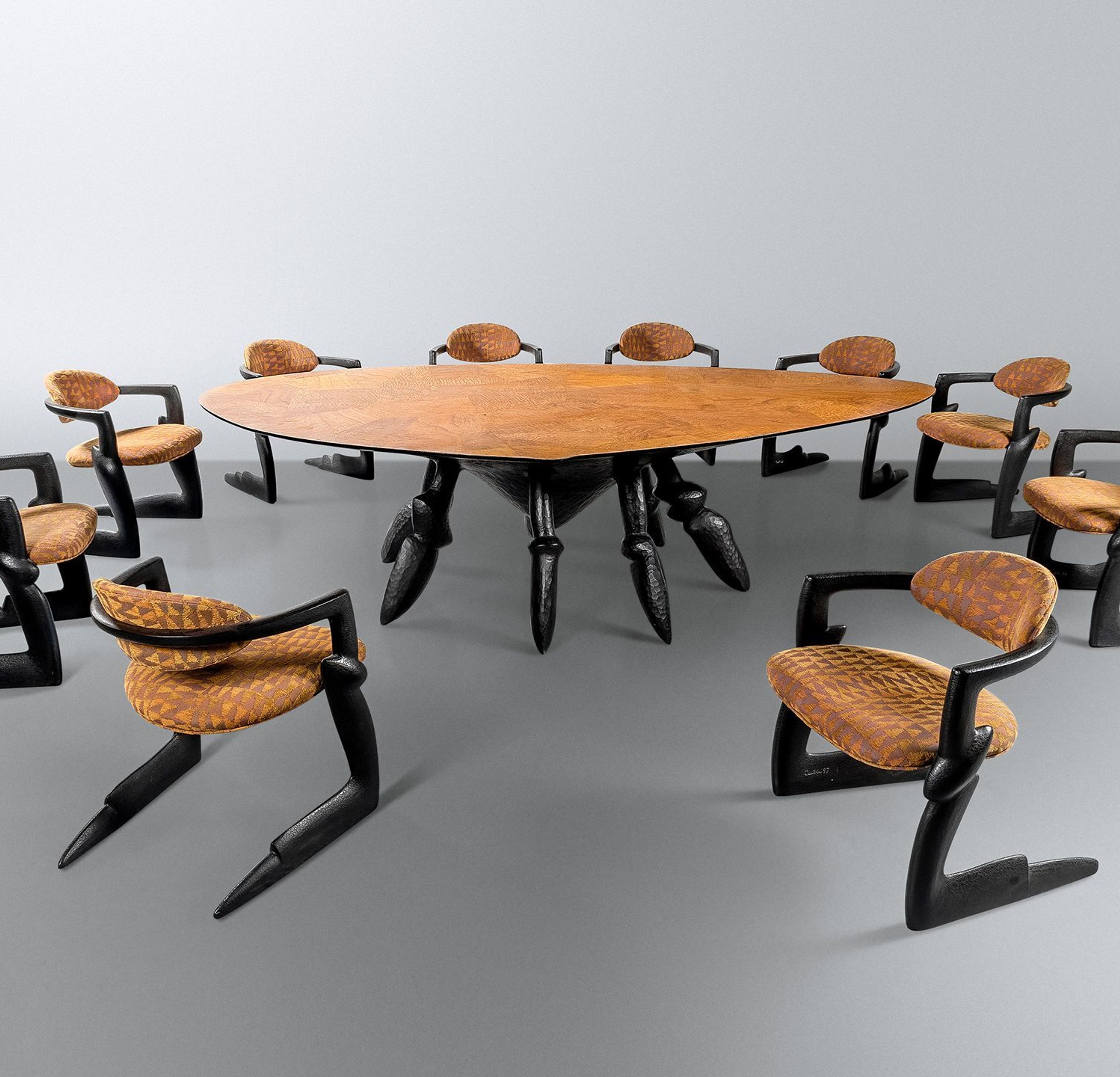
As furniture forms go, dining tables are hard to get right: a horizontal expanse that hides the undercarriage from view, surrounded by a set of chairs further prevents the table from making a statement. Yet the dining table is also one of the most important pieces of furniture in a home, a social object, around which conversation, family and friendship form. By Glenn Adamson Lot 46 | Wendell Castle (1932-2018), Seven Days of the Week Dining Table and Ten Chairs, 1997. Estimate: $60,000 – $80,000 Wendell Castle, never one to shy from a challenge, returned to the typology often. He first tackled it in 1966, making three similar dining tables in walnut, one for his own use. All featured an ingenious means of opening up the form: a central aperture yielding a view down to a sculpted pedestal. These works exploit Castle’s signature stack lamination technique, which freed him from conventional joinery and allowed him to compose freely in space. Four decades later he returned to this idea for a dining table that he nicknamed the “hole in one.” (It was made for the 2015 exhibition Wendell Castle Remastered, at the Museum of Arts and Design.) It sports a triad of conical supports, the tallest seven feet high, and a top that extends outward in a long cantilever. The design was achieved with CNC carving, which Castle employed to hollow out the wooden top, then filling it with hard light foam, and overlaying a veneer. The result is a featherlight shape that extends breathtakingly into midair. Lot 47 | Wendell Castle (1932-2018), Seven Days of the Week Cabinet, 1997. Estimate: $15,000 – $25,000 Right at the midpoint between these two moments, in 1997, Castle created his Seven Days of the Week suite for the Springborns. He was on an impressive run, having just realized his monumental Star Cabinets (shown to great advantage at Peter Joseph Gallery in 1995). The strong organic silhouette of these designs is reprised in a more articulated form in the Seven Days pieces, all of which have legs suggestive of an arthropod’s. In the dining table, the legs stage a vivid contrast with the smooth asymmetrical top, recalling midcentury biomorphic designs by Isamu Noguchi. The accompanying chairs feature continuous frames, running along the floor, up, around, and back again. Castle made many variations on this low-slung format enacts a sort of visual lean, yielding pride of place to the majestic table and its sculptural base. Yet another wholly original solution, from a wholly original designer. Glenn Adamson is a curator and writer who works at the intersection of craft, design history, and contemporary art. He has previously been a Senior Scholar at the Yale Center for British Art, Director of the Museum of Arts and Design; Head of Research at the V&A; and Curator at the Chipstone Foundation in Milwaukee. Adamson’s new book, “Craft: An American History,” examines how makers, carpenters, and blacksmiths took on the central role in shaping America’s identity. Featured Work: Wendell Castle (1932-2018), Seven Days of the Week Dining Table and Ten Chairs, 1997. Estimate: $60,000 – $80,000
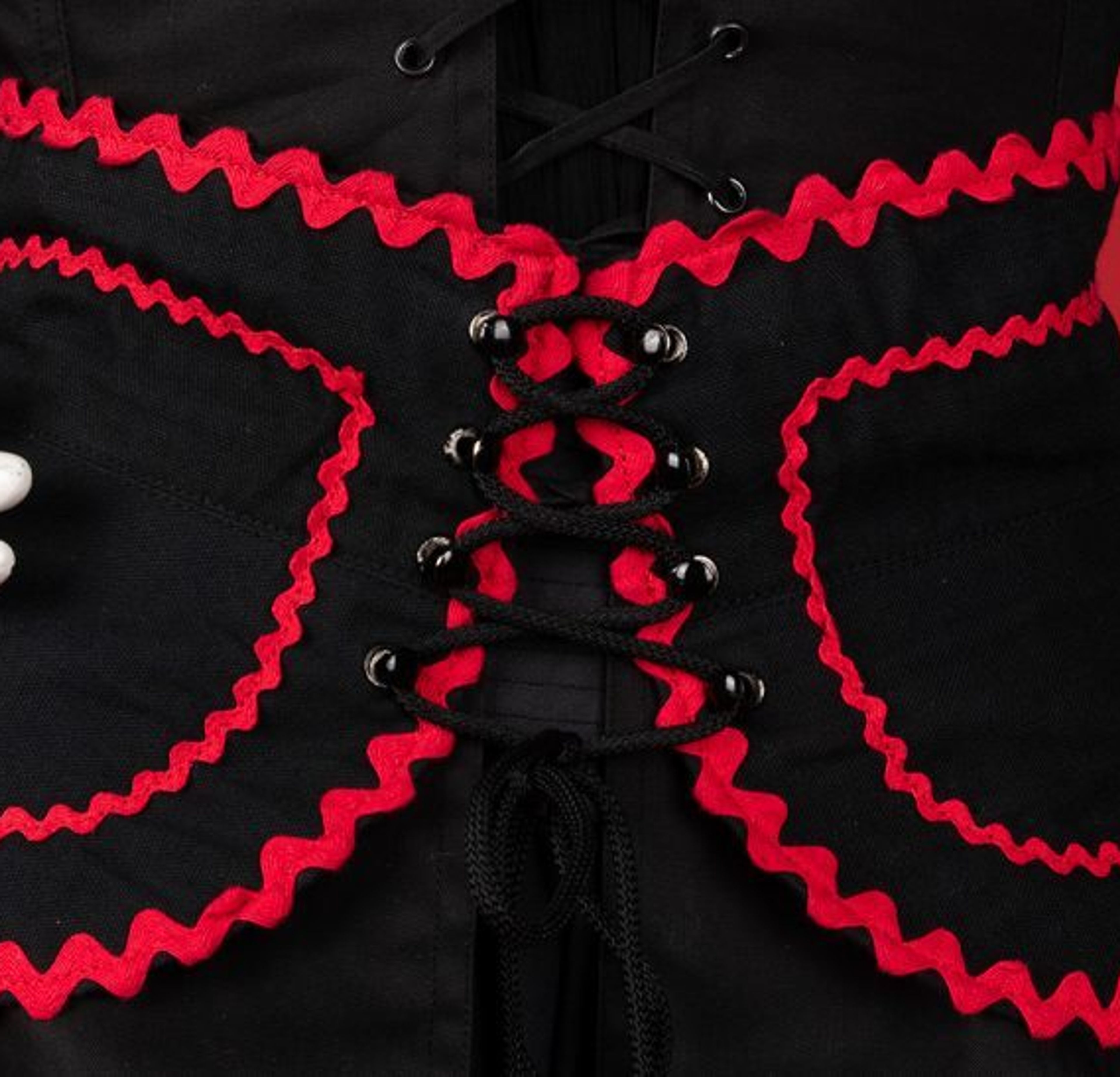
PARIS, July 28—Yves Saint Laurent presented a fall couture collection today that will change the course of fashion around the world. It is as stunning in its impact as the collection Christian Dior showed in 1947, the one that came to be known as the New Look and affected the way women dressed everywhere.[i] So declared the New York Times in the summer of 1976, following the debut of Yves Saint Laurent’s Russian collection. In most instances, a work’s profound impact is recognized in hindsight. Rarely is its effect so immediate, as was the case that July. Saint Laurent’s was a show of extravagance in rich fabrics and sumptuous colors. “The new turn – the new excitement – in fashion is the new feeling for ornamentation. It’s the fashion breeze that started at Saint Laurent,” said Vogue, thus igniting a trend of more drama and ornamentation than the prevailing American style had seen in years. Presented in haute couture and adapted for Rive Gauche, the impact of this collection was fast and widespread. Until this point, American collections had been reserved and polished, even restrained. This explosion of color marked a changing tide in fashion, one that the fashion press celebrated as a shift in women’s wardrobes, even calling it Saint Laurent’s New Look.[ii] The New York Times was visionary in its assessment of the collection. From the collection of Martha Smith Simpson, lot 8 is a rare example of a complete ensemble from Yves Saint Laurent’s 1976 Peasant Rive Gauche collection. Featuring a crepe blouse, laced corselet, a belt and a skirt embellished and trimmed with red and green rickrack, it captures the intoxicating appeal of this moment in fashion. Billowing sleeves, long skirts and eclectic details are laced and cinched at the waist, feminine and romantic. “In a room full of people, the woman in an understated style has a tough time attracting attention,” said American designer Bill Blass in 1976. “It’s hard to get away with a simple chiffon or jersey dress these days. The dress has to look important.”[iii] This collection, replete with glimmering taffetas, rich velvets and topped with headscarves, showed a side of feminine fashion that brought the allure of the nostalgic and the exotic. Color and romance prevailed, carrying out Saint Laurent’s dream of another place and time. In his search for something new in fashion, Saint Laurent relied on the French belief in the eternal: following in the path of Delacroix, Ingres, Poiret, visions of the non-French, of the Other, bring to fashion an exotic, intoxicating glamour.[iv] Like his predecessors in fashion and the visual arts, Saint Laurent’s search for the modern borrows from the past, from imaginary voyages to faraway lands. He did not travel to Eastern Europe in the years prior; instead, he drew from Sergey Diaghilev’s Ballets Russes of the 1910s and 1920s, and Dr. Zhivago, 1965. Inspired by visions of Russia from film and fantasy, the result is culturally hybrid and of indeterminate origin. “For the day,” the designer said, “everything starts with traditional cuts from Russia, Czechoslovakia, Austria, Morocco. From there comes this naiveté of the cut which makes it youthful, with the color.”[v] In 1976, the “new” in Parisian haute couture was derived from tradition and folklore, reanimated and reimagined. Art critic Pierre Schneider, in the same year, observed, “Here we can see how artful fashion has become in its interpretation of history. It is not a nostalgia for the past, but for the eternal present, beyond the past.”[vi] As audiences were swept away by the romance of the collection, some raised doubts about its relevance to normal life.[vii] For a show that sought to transport and transcend, it cannot be divorced from its political context. Saint Laurent envisioned the Russian peasant class with a sense of ease and detached nostalgia during a time of global tensions between the Soviet Bloc and the West. The Russian collection reimagined, for European audiences, a peasant class subject to Soviet control in the midst of a Cold War. Off the runway, art, fashion, and international relations intertwine and exist in real space and time. By the winter of 1976, the United States and the USSR had agreed to a series of five major art exchanges between American and Soviet museums through 1980. This monumental agreement was an intentional and calculated attempt at a détente between the nations via increased “cultural contacts.”[viii] With material from Russian museums, The Metropolitan Museum of Art in December of 1976 opened the exhibition “The Glory of Russian Costume.” Notably, alongside displays of embroidered peasant dress and royal couture, “in honor of the occasion, a number of women… wore bouffant colorful tiered or ruffled taffeta dresses from Yves Saint Laurent’s widely publicized peasant collection.”[ix] At the time of its debut, the fashion press anticipated that this collection would change the course of fashion. By the time it was adapted for Rive Gauche boutiques, stockists struggled to keep up with demand. Since the spring of 1977, when the Peasant collection became available for Rive Gauche, its silhouette became the look for fashionable women in the evening. This was the same season when Neiman Marcus in Northbrook, Illinois opened its own Rive Gauche boutique, where the late Mrs. Simpson likely purchased her own ensemble.[x] Doubts about the peasant collection’s wearability were assuaged as soon as it became available for retail. The dream of fashion becomes lived experience, and, available through Rive Gauche, enables every woman to participate. Saint Laurent’s eastward voyage intertwines imagination with custom, showing that the true luxury of fashion is the freedom to be transported. For Schneider, “What Saint Laurent has done, with his latest collection, is to remind us that fashion, in its radical form of haute couture, is costume…His Albano-Circassians and Slavo-Touaregs proclaim that haute couture can only be, in its looks, what it already is from the standpoint of economics: impossible.”[xi] Between the imagined past and the lived present is where the fantasy of fashion resides. For the fashionable woman’s wardrobe, Saint Laurent offers newness in the form of tradition and a belief in the unchanging. High fashion emerges from folklore and reverie, and makes visible that it is implicitly contingent, responsive, and political. Lot 8, A Rive Gauche Peasant Ensemble, is available in Spring Fashion: A Century of Couture on March 18. [i] “A Revolutionary Saint Laurent Showing,” The New York Times (New York, NY), July 28, 1976, p. 1. [ii] Ibid. [iii] Bernadine Morris, “Nights Still Thrive,” The New York Times (New York, NY), December 27, 1976, p. 50. [iv] “‘Opéras – Ballets russes’ Collection,” Musée Yves Saint Laurent Paris, March 14, 2021, https://museeyslparis.com/en/biography/collection-opera-ballets-russes-ah [v] Ibid. [vi] Pierre Schneider, “The Assurance of Dreams,” Vogue (New York, NY), September 1976, p. 228. [vii] “A Revolutionary Saint Laurent Showing,” p. 1. [viii] David K. Shipler, “Moscow and Met Museum Agree on 5 Art Exchanges,” The New York Times (New York, NY), August 30, 1975, p. 1. [ix] Bernadine Morris, “Metropolitan Toasts a Dazzling Russia of Old,” The New York Times (New York, NY), December 7, 1976, p. 1968. [x] Genevieve Buck, “Rive Gauche Boutiques are Blossoming in Chicago,” Chicago Tribune, (Chicago, IL) March 14, 1977, Accessed February 24, 2021, p. B3. [xi] “The Assurance of Dreams,” p. 228.
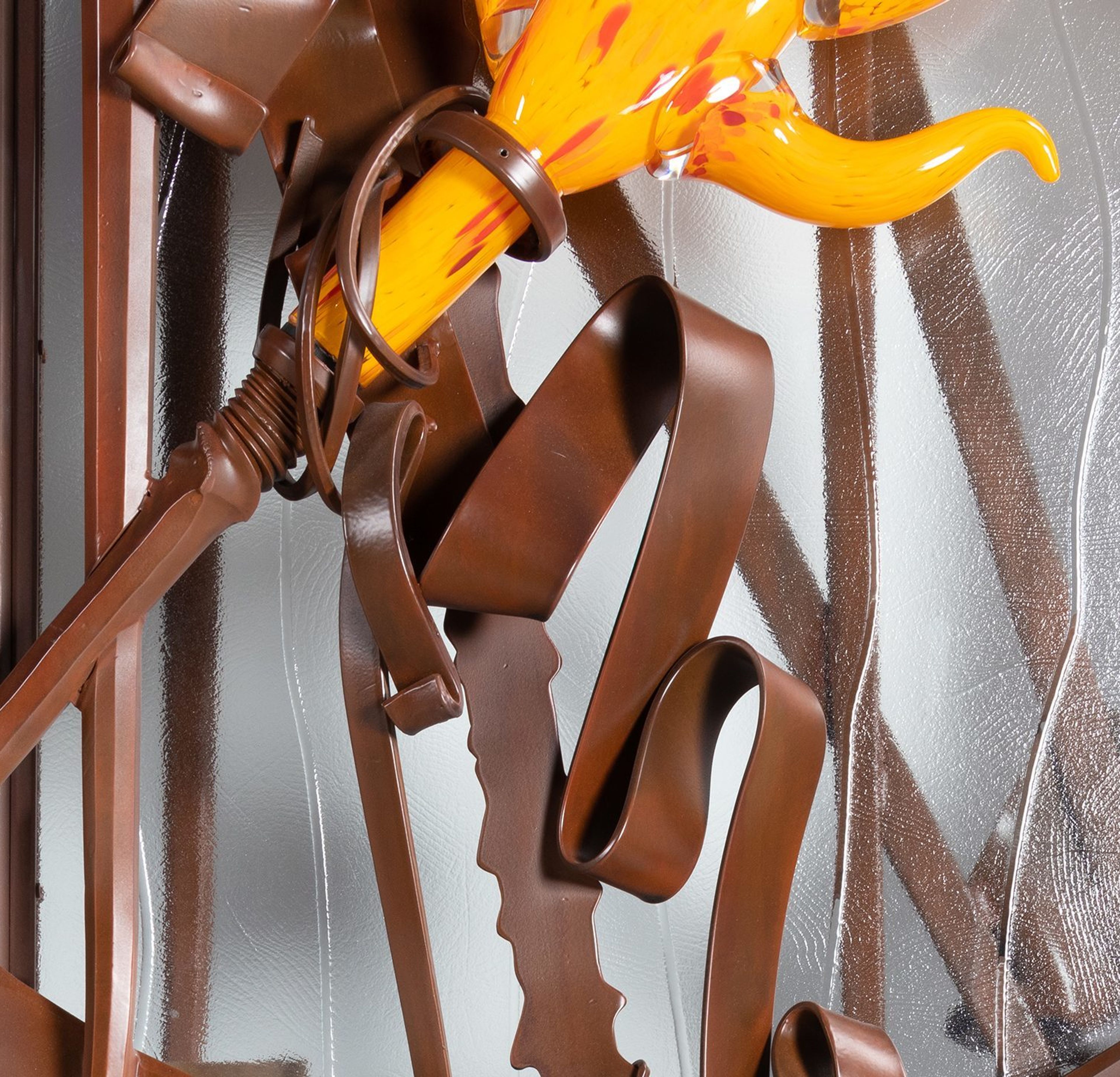
Art-curious visitors to the home of Robert and Carolyn Springborn didn’t have long to wait. They were greeted right at the entrance by one of the collection’s most spectacular works: this pair of doors by Albert Paley. By Glenn Adamson This artist will need little introduction as one of the preeminent American sculptors of the last half century. He is also the nation’s leading blacksmith – a craft that nearly died a century ago, with the advent of the automobile (countless smithies closed, or were converted to mechanic shops), but had a dramatic return in America, marked by the founding of the Artist-Blacksmith Association of North America (ABANA) in 1973. Paley, already renowned for his work in jewelry, was the clear artistic leader of this renaissance. Lot 37 | Albert Paley (b. 1944), Important Entrance Doors, 2004, glass elements executed by Martin Blank. Estimate: $30,000 – $50,000 Paley’s great early masterwork was a set of gates, which won a competition for the then-new Renwick Gallery in Washington. The project made his fame, launching his career as an architectural-scale metalworker. The Springborns’ entrance doors, made three decades later, show how he progressed from that early success. The Renwick gates are composed of delicate tendrils, which fling themselves up the center of the composition and then curl away into numerous whorls and squiggles, suggesting that ancient mythological emblem, the Tree of Life. The Springborns’ doors feature a similar concentration in the lower central passage, but there the resemblance ends: the composition is disjunctive rather than sinuous, with something of the jagged, explosive vocabulary seen in Paley’s contemporaneous public sculptures. Lot 37 | Albert Paley (b. 1944), Proposal Drawing for Entrance Doors The doors are further enlivened by the incorporation of glass elements, made by Paley’s frequent collaborator Martin Blank, an important figure in the circle of Dale Chihuly (who did for glass what Paley did for metal, transposing it several keys upward into a spectacular, baroque sculptural medium). Blank’s polychrome glass introduces a lightness of gesture to the doors, like brushstrokes standing out against an intensely worked backdrop. The effect is gloweringly theatrical, bringing to mind the paintings of Clyfford Still, or, closer to Paley’s heart, the avatars of French Art Nouveau, such as Hector Guimard. Such comparisons aside, the doors show Paley himself operating at the height of his powers. With a true sense of dramatic occasion, the portal promises marvels that might lie beyond – that was certainly the case at the Springborn residence – while also constituting a wonder in its own right. Glenn Adamson is a curator and writer who works at the intersection of craft, design history, and contemporary art. He has previously been a Senior Scholar at the Yale Center for British Art, Director of the Museum of Arts and Design; Head of Research at the V&A; and Curator at the Chipstone Foundation in Milwaukee. Adamson’s new book, “Craft: An American History,” examines how makers, carpenters, and blacksmiths took on the central role in shaping America’s identity. Featured Work: Albert Paley (b. 1944), Important Entrance Doors, 2004, glass elements executed by Martin Blank. Estimate: $30,000 – $50,000
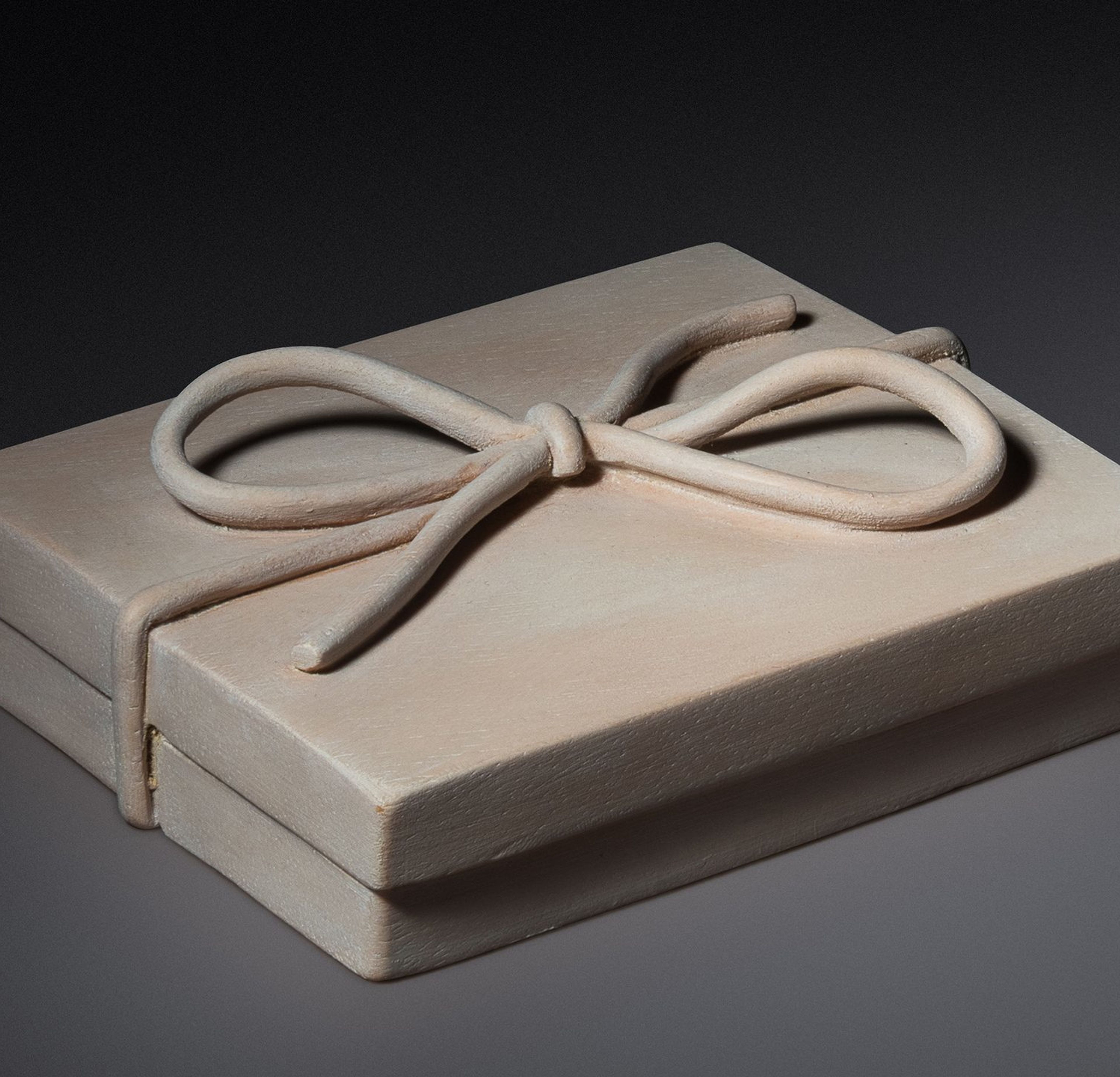
Art movements come and go with the regularity of the tide, with currents pulled along by a few key innovators, others following in their wake. Such was certainly the case with studio furniture. As a way of working, it had antecedents in the Arts and Crafts era. By Glenn Adamson Left: Sam Maloof (1916-2009), Rocking Chair, 1993. Estimate: $20,000-$30,000. Right: Sam Maloof (1916-2009), Pedestal Table, 1993. Estimate: $4,000-$6,000. But it was not until the mid-century era that it began to take a recognizable shape: one maker (perhaps with a couple of assistants) creating self-designed, expressive furniture, entirely by hand. Even by the late 1950s, the main exponents of this approach – men like Wharton Esherick, George Nakashima, and Sam Maloof – did not even know one another. So it can hardly be said to have been a movement. Nonetheless, a definite new approach to furniture-making was in the air, based in the values of independence, experimentation, and creativity. With the emergence of Wendell Castle on the scene in the 1960s, the sculptural implications of this early activity – its artistic potential – gradually became clear. And with the maturation of the field, part of a general advancement of craft in America, studio furniture makers came to recognize themselves as a breed apart. Their efforts paralleled developments in ceramics, fiber, glass, and metal, yet remained particular to some degree. The sheer scale of furniture meant that collectors were few; studio-based makers worked mostly on commission, for private clients. Left: Wendell Castle (American, 1932-2018), Vargo Clock, 1995. Estimate: $2,000-$4,000. Right: Wendell Castle (1932-2018), Three-Star Console Table, 1996. Estimate: $8,000-$12,000. For a brief time, at the crest of the wave, these conditions decisively altered: the country’s most accomplished makers suddenly had an unprecedented opportunity to pursue their visions. The man who made this possible was Peter Joseph, an investment banker with a love of art, who opened his eponymous Manhattan gallery in 1991. It was more a patronage structure than a commercial proposition: Joseph’s goal was to elevate the field, offering his moral and financial support to the best furniture makers in the country. With Castle as a presiding eminence, younger figures – among them Tom Hucker, Wendy Maruyama, Alphonse Mattia, and Ed Zucca – made extraordinarily ambitious work, stylistically poised at the edge of postmodernism, but with a dedication to craftsmanship typically absent from that (other, larger) movement. Cabinetmaking in wood was the main focus at the gallery, but space was also made for Albert Paley – America’s leading blacksmith – as well as object makers like Michelle Holzapfel. Left: Right: Thomas Hucker (b. 1955), Slatted Table, 1991. Estimate: $2,000-$4,000. Right: Alphonse Mattia (b. 1947), Architect’s Valet, 1991. Estimate: $3,000-$5,000. Robert and Carolyn Springborn encountered studio furniture before they ever stepped into Joseph’s space. The initial spark was the Museum of Fine Arts, Boston, exhibition New American Furniture (1989), curated by Edward S. Cooke, Jr. (He soon went on to Yale University, training a generation of craft scholars, including myself.) This show had a straightforwardly effective premise. Each invited artist created a work in response to a historic object in the museum’s collection, a conceit that highlighted both continuities with and departures from tradition. Left: Edward Zucca (b. 1946), Mail Me to Heaven, 1990. Estimate: $800-$1,200. Right: Jay Stanger (b. 1956), Stand at Ease, 1993. Estimate: $2,000-$4,000. The Springborns demonstrated their adventurous taste, at the MFA show, by falling in love with the explosively colorful work of Jay Stanger; they immediately ordered a chair from him. That direct pathway was typical for them, and other craft collectors of their generation. They prized the relationships that they built with furniture makers; one could fairly say that as their home filled with exuberant chairs, tables, and cabinets, they felt surrounded by friends. But pursuing this new interest also led them straight to Peter Joseph, and it was through him that they came to know the work of Castle and Paley, which they went on to collect in particular depth. Maruyama was another favorite, for her puckish cross-cultural aesthetic statements. Left: John Cederquist (b. 1946), Little Waves Attempting the Rope Trick, 2004. Estimate: $8,000-$12,000. Right: Judy Kensley McKie (b. 1944), Butterfly Cabinet, 1993. Estimate: $2,000-$4,000. The Springborns also explored beyond the confines of Joseph’s program, acquiring several pieces each by the consummate master of zoomorphic design, Judy Kensley McKie, and by the California trompe l’oeil ironist John Cederquist. This commitment to the field was unusual, to say the least – Castle himself said, “I can’t think of anyone who has collected more in-depth than they have” – and was recognized by a 2009 exhibition and accompanying catalogue, Living With Studio Furniture, organized at the Naples Museum of Art, near their Florida home. The present offering of material from the Springborns’ collection is a valuable cross-section of a magical time, for them personally and the field at large. Joseph was tragically forced to close his gallery after only six years, due to illness (he died of cancer in 1998). Yet studio furniture would retain its vitality for some years to come, with an organization devoted to the field, the Furniture Society, founded in 1996. Twenty-five years on, the landscape has shifted. New galleries arriving on to the scene, like Carpenters Workshop, Friedman Benda, and R & Company, have emphasized the radical design context rather than that of studio craft, implying a European rather than American lineage for their concerns. Younger makers, likewise, tend to consider themselves either designers or artists first and furniture makers second. Yet in many ways, the propulsive energies that were set in motion by the midcentury generation – their emphasis on individual creativity, and the idea of furniture as an opportunity for self-expression – can still be felt in contemporary practice. The Springborns were lucky enough to be there when the studio furniture field crested to its height. And smart enough to catch the wave. Glenn Adamson is a curator and writer who works at the intersection of craft, design history, and contemporary art. He has previously been a Senior Scholar at the Yale Center for British Art, Director of the Museum of Arts and Design; Head of Research at the V&A; and Curator at the Chipstone Foundation in Milwaukee. Adamson’s new book, “Craft: An American History,” examines how makers, carpenters, and blacksmiths took on the central role in shaping America’s identity. Featured Image: Wendell Castle (1932-2018), Ceci n’est Pas un Cadeau (This is Not a Gift) Carved Box, 2001. Estimate: $1,5000-$2,5000.
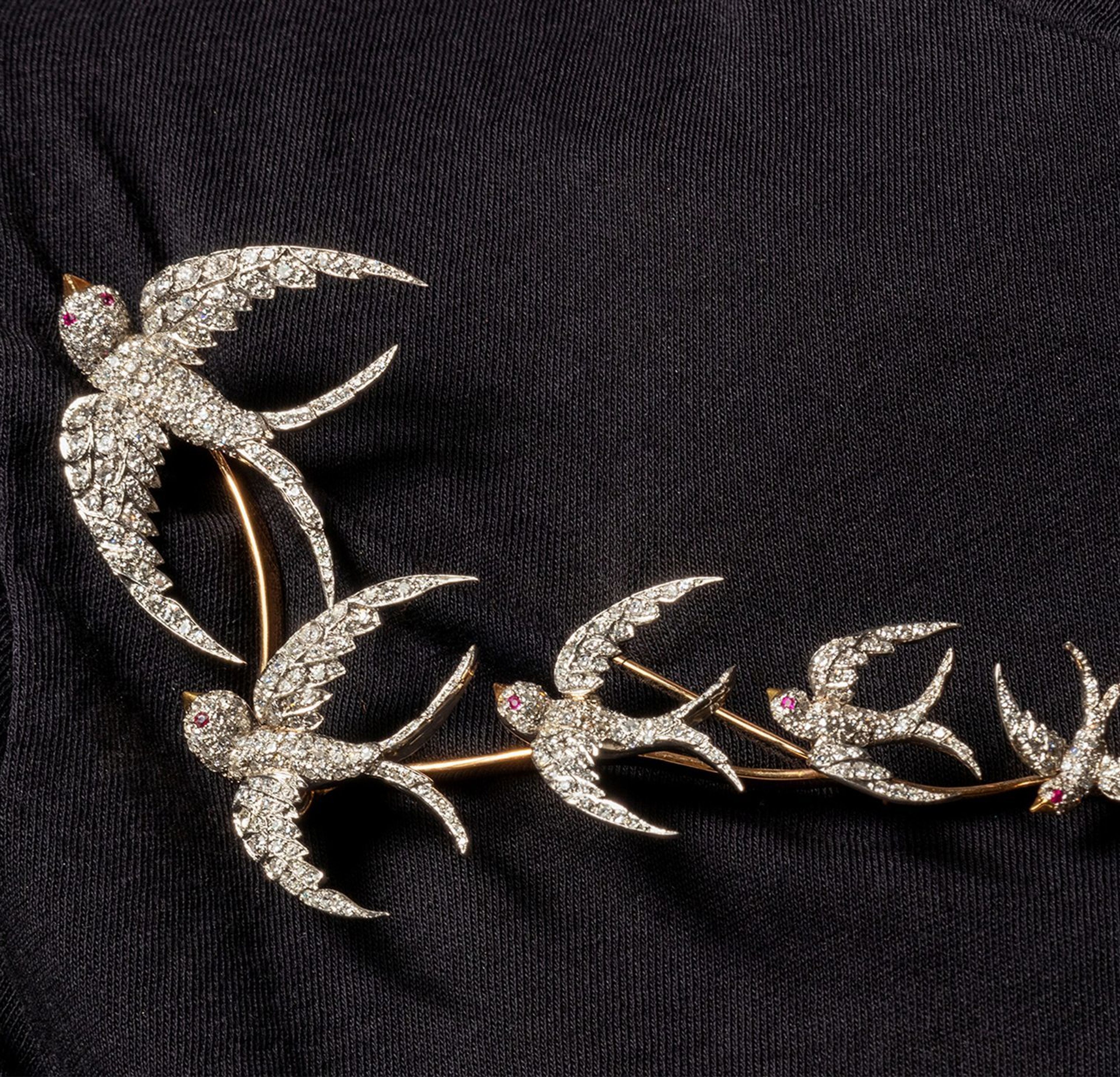
In honor of Women’s History Month, Hindman is delighted to present six female Specialists and the stunning works by female artists that inspire us all. Monica Brown, Senior Specialist, Fine Art Louise Bourgeois (French/American, 1911-2010), Toi et Moi, 2006. Estimate: $5,000 – $7,000. Included in Prints & Multiples sale on May 5, 2021. “When I think of iconic female artists, my mind immediately goes to Louise Bourgeois. The first time I saw one of her spider sculptures I was shocked that it was titled ‘Maman’. This push and pull between meaning and the viewers’ perception is something that I have always admired in her work. We are excited to handle this edition by the artist in our May 5th Prints and Multiples auction. To me, this small scale work embodies so much about Bourgeois – the musical staves printed on fabric hearken to her childhood steeped in tapestries and music, the words echo her constant investigation of the connection between two people. However, unlike her large scale spiders, this work is steeped in a softness and intimacy that I find incredibly moving.” Genevieve King, Associate Specialist, Decorative Arts & Collectibles Harriet Whitney Frishmuth, The Star, 1918. Estimate: $6,000-$8,000. Included in A Gentleman’s Pursuit on April 27, 2021. “Harriet Whitney Frishmuth (1880-1980) was an American sculptor known for her spirited renderings of the female form, particularly professional dancers. Born in Philadelphia, she moved to Europe as a teenager with her family, where she went on to study art in Paris and Berlin; she studied briefly with Auguste Rodin at the École des Beaux-Arts in Paris. She eventually moved back to New York City, where she established a successful career as a sculptor and educator, her work sought by museums and private collectors alike. Her work has been exhibited at the Metropolitan Museum of Art, the National Academy of Design, the Pennsylvania Academy of Fine Arts and the Paris Salon, among other distinguished venues and institutions. I learned during my research of her express disdain for the designation of “sculptress,” which I appreciate.” Danielle Lin, Specialist, American History, Decorative Arts & Collectibles American Anti-Slavery Society, Am I Not a Woman & A Sister, Belville, NJ: Gibbs, Gardner & Company, 1838. “I love this piece because even though it is a token, something metal and somewhat impersonal, the imagery and sentiment it bears humanizes the enslaved. The token, in my mind, is so closely associated with the women of the abolitionist movement, and many who went on to be pioneers for women’s suffrage as well. One of my favorite figures is Sarah Parker Remond who was a free woman of color who made her first public speech against slavery when she was just 16 years old. She was a member of the American Anti-Slavery Society and in 1858 traveled abroad to help garner support for the abolitionist cause. During the Civil War, she would appeal for the British to support the Union and afterwards fundraised for the newly emancipated people. She then became a medical doctor in Italy, practicing there until her death in 1894. Women had a prominent and important role in the global abolitionist movement from its earliest days. In the 18th century, women were significant organizers of the sugar boycotts of the 1790s and they also purchased and wore “Am I Not a Man and a Brother” Wedgwood Jasperware cameos which inspired this token. Women are credited with maintaining the momentum of the abolition movement in the 1820s and 1830s after the Slave Trade was abolished but slavery itself persisted, with the publication of essays and public involvement in anti-slavery societies, including the American Anti-Slavery Society which issued this token in 1838. The American Anti-Slavery Society was founded by prominent male abolitionists William Lloyd Garrison and Arthur Tappan, and Frederick Douglass and William Wells Brown became key leaders of the Society, but women were notable and influential members. The Society counted Lucretia Mott, Susan B. Anthony, Elizabeth Cady Stanton, Lydia Maria Child, Maria Weston Chapman, Abby Kelley Foster, Sarah Parker Remond, Lucy Stone, and others among their membership. Their involvement became a contentious issue, however, and the debate over whether they should be viewed as “coworkers, not subordinates” split the group. In 1840, the Society was invited to the World Anti-Slavery Convention in London, but a ruling was made to exclude the female members, forcing them to view the proceedings in the gallery and not participate.” Sally Klarr, G.G., Director, Senior Specialist, Jewelry & Timepieces Evelyn Clothier, Diamond Swallow En Tremblant Brooch. Estimate: $4,000 – $6,000. Included in the Important Jewelry auction on May 18, 2021. “I am pleased to have so many lovely pieces by Evelyn Clothier coming up for sale this spring. Most of her designs are whimsical (like the Flamingo Brooches we sold in our Palm Beach sale in February) and also some are inspired by antique jewelry. This particular brooch is very invocative of antique jewelry – made out of platinum and yellow gold, the diamond swallows are en tremblant meaning “to tremble”. Jewelry made in the 18th and 19th Centuries would sometimes have parts on a small spring to give movement to a section of a piece. This created an especially mesmerizing effect in candlelight that must have been quite romantic in the evenings. Evelyn Clothier jewelry is so well made to match antique styles like this and I love everything about this brooch! I am excited to show more of her pieces in our May 18th Important Jewelry auction.” Katherine Hlavin, Director and Specialist, Western & Wildlife Art Glenna Goodacre (American, 1939-2020), Butterfly Dancer, edition 18/20. Estimate: $2,000 – $3,000. Included in Western Paintings and Sculpture including Contemporary Native American Art Session I on May 6, 2021. “Glenna Goodacre had a remarkable career of being one of the preeminent female sculptors in America. Her bronzes, primarily of figures, always evoked a sense of emotion and power. One of her most noted bronzes is a monumental piece at the Vietnam Women’s Memorial in Washington, D.C. When I think of important sculptors in Western American art, Goodacre is always at the top of my list. “Butterfly Dancer” is a great example of how Goodacre incorporated grace and poise into her sculptures. This piece captures the essence of the Southwest, tying in Native American culture and the power of women.” Erin Rust, Specialist, American Indian Art & Artifacts, Native American, Prehistoric & Tribal Art Plateau Child’s Beaded Hide Cradleboard, with Pinto Horse, late 19th century. Estimate: $4,000-$6,000. Included in the Native American Art sale on April 16, 2021. “Native beadwork throughout the United States has been traditionally a woman’s art, adorning everything from clothing, to cradles, to daily work bags and horse regalia. The craft of beadwork evolved from the earlier tradition of using dyed quills, bird or porcupine, to decorate. When European glass beads were introduced by traders, the use of these colorful materials became the popular choice. The creative and technical skills that these women artists have, were and still are, praised in Native communities across the county. For me, this Plateau cradle showcases the artistic expression that goes into a beaded design. The Prancing Pony on the cradle speaks to the importance of the horse in Native cultures, and as an equestrian, really speaks to what fascinated me about Native American history and culture, and how I originally became interested in my field of study.”
Hindman is excited to partner with the Booth Western Art Museum to present an outstanding online auction, For the Love of Art, with bidding beginning on February 8. For the Love of Art will include a range of Western fine art, jewelry and books. The auction is an exciting opportunity to acquire pieces while supporting the world’s largest permanent exhibition space for Western art and their mission. Notable pieces include Robert Griffing’s painting, Wonderfully Expert (lot 9), which has a presale estimate of $18,000-23,000. Other highlights include Steve Penley’s John Wayne (lot 8), a mixed media work (estimate is $12,000-15,000), and Sonya Terpening’s Not One More Step (lot 6) (estimate is $9,000-12,000). We spoke with Seth Hopkins, Executive Director of the Booth Museum, about how the museum has moved to a new digital format for the auction and gala this year, and what bidders should pay attention to at this year’s event. Lot 9 | Robert Griffing (American, b. 1940) Wonderfully Expert, 2019 oil on linen Hindman Auctions: Tell us about Booth Western Art Museum’s annual Gala Weekend and how the format is different this year. Seth Hopkins: Due to the pandemic, we’ve adapted the gala and auction for a digital format. Normally the Booth Museum Gala weekend is the biggest annual gathering of Western art collectors and aficionados in the Southeast. There are always a number of friends from all around the country who converge on Cartersville, and it’s like a homecoming. Everyone has a great time renewing acquaintances, meeting the artists who come and buying art to support the museum. This year we are trying to replicate that experience digitally through a Zoom celebration that includes special music, a celebrity roast, interactive games and a live auction. Clearly the highlight of the event this year is the 70 lots of art, jewelry and books that are being auctioned on Hindman’s Digital Bid Room. HA: How many artists are represented and how are they selected? SH: Over 50 artists, most of whom donated the work in the auction, are featured in this year’s auction. The fact that these artists would donate their work to the museum shows they value the museum’s approach, which is to work with living artists, galleries, auction houses and collectors to grow the interest and appetite for Western art in the Southeast. We welcome any artist to submit work to our auctions, which are juried to ensure we maintain a high quality and puts the artist’s work in the best light. We sincerely thank Hindman for their support in presenting this auction. HA: Which artists are collector favorites, and are any represented in the Booth’s collection? SH: The rock stars in the auction this year include Atlanta’s own Steve Penley, Robert Griffing, one of the top painters of eastern Woodlands Indians, and Sonya Terpening, a wonderful watercolorist and oil painter from Texas. Also featured are Cowboy Artists of America members Michael Donahue, Paul Moore, Gary Niblett, and Bill Nebeker. There are also very fine works by Dan Bodelson, Dan Meiduch, Charlie Fritz Jason Rich, Clyde Morgan and Kathy Wipfler. Many of the artists represented in the auction are also in the museum’s permanent collection or have been featured in major temporary exhibitions over the years. HA: Is there anything else noteworthy about the artists in this year’s silent auction? SH: There is also a wonderful group of miniature works that would normally be grouped into a separate sale during the weekend but this year they are mixed in the silent auction. Many of these were created by artists who are instructors at our art academy. They are great artists in their own right but also choose to share their talents with students on a regular basis. Often times auctions of this type can offer great value at a relatively low cost, while supporting a deserving non-profit. Collectors looking to add depth to their traditional Western holding will find wonderful small to mid-size works by Dan Bodelson, Dan Meiduch, John Fawcett and Charlie Fritz, while buyers interested in more contemporary style works will find fresh works by Kim Wiggins, Amy Lay and Logan Maxwell Hagege. Lot 6 | Sonya Terpening (American, b. 1953) Not One More Step, 2020 transparent watercolor HA: Why do you think this genre appeals to collectors? SH: We believe Western art resonates with our audience, first because of the nostalgia from growing up with the television and later movie Westerns. There is also a universal appeal of the great American West with its wide-open spaces and majestic mountains that are often featured in the artwork. In helping new collectors get started, I tell them to be patient and to try to envision what types of artwork would make up a collection that they would want to live with over the long term. We actually offer couples collections counseling as one of the services at the museum where we help couples try to identify the overlap in their likes and dislikes when it comes to art. Once you have a sense of what you want to collect and what your budget might be, then you can move forward with more confidence when you see a piece you want to live with. HA: What is your advice to new collectors or those looking to deepen their collection? SH: When collectors ask me what to collect. I tell them to try to find pieces that pass the “Seth Hopkins’ Pink Fuzzy Slippers Test.” This test kicks in on Sunday morning when you are padding around your quiet home with a cup of coffee in one hand and the Times crossword in the other, and out of the corner of your eye you spy a work of art you are the custodian of for this generation and you get to LIVE with it. A grin creeps over your face because you get to see this art every day. That is the main reason to buy a piece of art, all else is secondary. With that in mind, I hope people all around the country will peruse the art in our benefit auction, graciously hosted by Hindman, and find something that passes the test for them. They will then have a wonderful piece of original art to enjoy along with the knowledge they are helping the Booth Museum accomplish its mission. Bidding for the sale will be open from February 8 at 10am through February 22 at 10am. For more information, please contact Diane Homesley at dianeh@boothmuseum.org or 770-387-1538 Featured image: Lot 8. Steve Penley (American, b. 1964), John Wayne, 2020, mixed media.
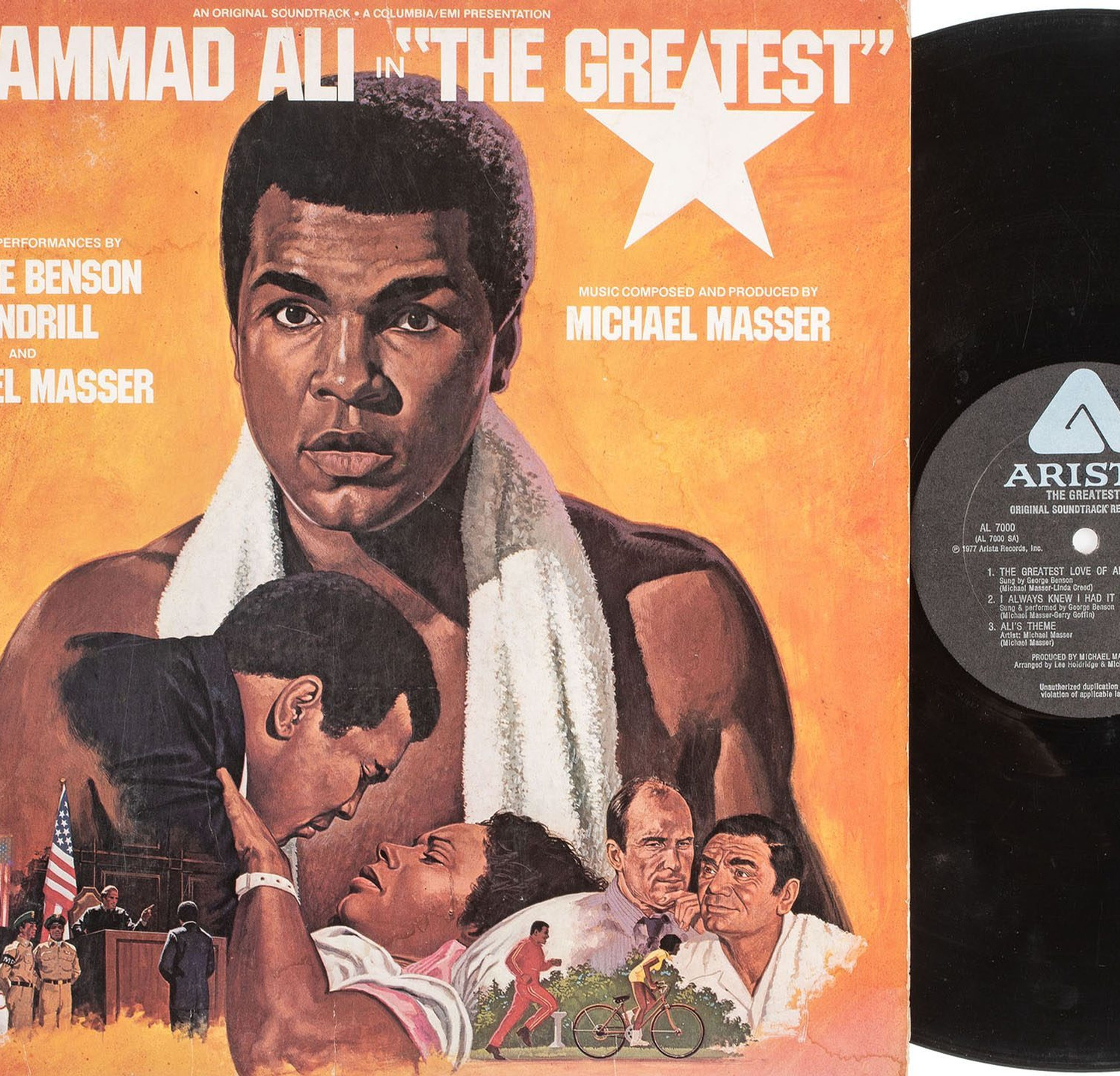
In honor of Black History Month, Hindman is pleased to highlight nine remarkable lots included in the upcoming African Americana sale presented by Cowan’s Auctions, a Hindman Company. A number of influential figures including Frederick Douglass, Booker T. Washington, Madam C.J. Walker, Marcus Garvey, Martin Luther King Jr., Huey Newton, Eldridge Cleaver, and Angela Davis are represented in the February 18 African Americana auction. Collectors can expect over 275 lots dedicated to themes such as slavery & abolition, militaria, civil rights, politics, art, literature, and more. Below are celebrated collectibles, relics and memorabilia exploring the intersection between Black History, Civil Rights, Art & Culture, and Music. Civil Rights Lot 178 |KING, Martin Luther Jr. (1929-1968). The Birth of a New Age. Cleveland: Stephens’ Recording Service, Memo Records, 1956. 33 rpm vinyl record (not tested for playback); original publisher’s illustrated cardboard sleeve (light scuffs, partial split to lower edge, light wear to extremities). A RARE RECORDING of the address King delivered in Cleveland on 7 August 1956, at the convention of the National Negro Funeral Directors Association when he was just 27. The recording was made by Carlton M. Stephens, a metallurgical engineer whose side business was producing records. Stephens corresponded with Dr. King throughout 1956 and early 1957 in a series of letters in which he requested permission, which Dr. King granted in a 27 September 1956 letter, and gave details and updates on the project. In a letter dated 20 December 1956, Stephens shares that “Sterling Hykes, local Negro artist of Kamaru House, designed the attractive jacket. It is modern, done in red, white, and blue,” adding “we took the liberty to add a few notes about Montgomery with the biography on the back. Material for this was collected and written by Mrs. Carriebelle J. Cook, local librarian and my wife.” Dr. King received $100 in proceeds from sales in a letter from Stephens dated 28 February 1957. (MLKP-MBU, Box 65, Howard Gotlieb Archival Research Center, Boston University, Boston, MA). VERY RARE: OCLC locates no copies and according to online records, no copy has ever sold at auction Estimate: $8,000 – $10,000 Lot 174 | [CIVIL RIGHTS]. Assorted Civil Rights ephemera. Comprising: CORE Comments. 3 issues (incomplete run). [Chicago]: Committee of Racial Equality, 1943-1944. 8.5 x 11 in. mimeographed newsletter, 3 issues numbering: Vol. 1 Number 12, September 1943; November 1943; 24 January 1944. –PECK, Jim (1914-1993), editor. CORE-Lator. 3 issues (incomplete run). New York: Congress of Racial Equality, 1959-1964. 8.5 x 11 in. newsletter, 3 issues number: Number 78, Fall 1959; Number 90, June 1961; Number 106, May-June 1964. — PECK, Jim, editor. Sit Ins: The Student Report. New York: Congress of Racial Equality, 1960. 6 x 8.5 in. booklet (soft vertical fold, abrasions with tape residue on front wrapper). With letters from 6 African American students about their experiences. — Freedom Riders Speak for Themselves: Mary Hamilton, Louise Inghram, and Others. Detroit: News & Letters, 1961. 5 x 7 in. booklet. — Southern Christian Leadership Conference: This is SCLC. N.p., [ca 1965]. 3.75 x 8.5 in. brochure with folding SCLC Organization Chart. — BOND, Julian (1940-2015). LEWIS, T.G., illustrator. Vietnam. [Tucson, AZ]: [Sixties Project], 1967. 8.5 x 11 in. comic book (staining at staples, small folds at lower right corner). Anti-war comic politician and civil rights leader Bond, who during his career helped to establish the Student Nonviolent Coordinating Committee (SNCC), helped found the Southern Poverty Law Center and served as its first president, and was the chairman of the NAACP from 1998-2010. — And 8 others. Together 19 works in 15 volumes, all in good to fine condition. Estimate: $1,000 – $1,500 Lot 229 | [Black Panthers] Black Panther. N.p., ca late 1960s-1970s. 25.25 x 15.5 in. (637 x 398 mm) hand-painted broadside on Hasko wooden tray (wood slats slightly separated at right edge, some chipping to paint). Hand-painted in black and orange with profile of a black panther and hand-lettered Estimate: $1,000 – $1,500 Art & Culture Lot 267 | [AILEY, Alvin (1931-1989)]. LINDQUIST, John, photographer. A group 54 photographs of African American performers and dance pieces. Including: Silver gelatin photographic stills of dancers, most performing at the Jacob’s Pillow Dance Festival in Beckett, Massachusetts, ca 1958-1980. Almost all of the photos are by John Lindquist who was staff photographer at the acclaimed dance festival from 1938-1980, and many of the images are stamped with his imprimatur. Photographs include Alvin Ailey at Jacob’s Pillow, 1958 (7) — Alvin Ailey & Co. at Jacob’s Pillow, including Carmen de Lavallade and James Truitte, 1958 (14) — Charles Moore (8) — Donald McKayle & Co. performing Rainbow Round My Shoulder (2) — Miscellaneous dancers, including Pearl Primus, Billy Wilson, Clay Taliaferro, and Jean-Léon Destiné (12) — Studies of Alvin McDuffie at Jacob’s Pillow by Stephen Driscoll, successor to John Lindquist (9, each 3 1/4 x 4 3/8 in.). Together, 54 photographs, 8 x 10 in. or smaller. Condition generally very good, with corner/edge wear to some prints. Estimate: $1,000 – $1,500 Lot 265| The Flaming Crisis with a Notable Colored Cast. Kansas City, MO: Quigley Litho. Co., [1924]. 28.25 x 42.25 in. movie poster. A large movie poster for the silent Western romance starring Dorothy Dunbar as Tex Miller, a beautiful cowgirl who falls in love with a young Black newspaperman convicted of murder on false evidence who has escaped the law. He defeats an outlaw band and gives himself to the law to discover that the real murderer confessed, allowing him to be reunited with Tex. Estimate: $700 – $900 Lot 258 | Jet: The Weekly Negro News Magazine [Vol. 1, Number 2]. Chicago: Johnson Publishing Company, 8 November 1951. 4 1/4 x 6 in. Illustrated throughout. (2 inner gatherings loose.) Original illustrated wrappers featuring Katherine Dunham (light soiling, spine split but covers attached). Also included in this lot, Jet: The Weekly Negro News Magazine. [Vol. 1, Number 5]. Chicago: Johnson Publishing Company, 29 November 1951. 4 1/4 x 6 in. Illustrated throughout. (1 central gathering loose.) Original illustrated wrappers featuring Josephine Baker (minor creasing). Two early issues of Jet magazine, founded in November 1951 by John H. Johnson (1918-2005). The magazine is considered one of the most influential African-American media businesses and chronicled the Civil Rights Movement including early events like the lynching of Emmett Till. RARE, with online records indicating that only one copy of each issue has seen the market. Estimate: $400 – $600 Music Lot 262 | EULA, Joe (1925-2004), artist. A group of two 1960s music posters featuring Eula artwork. Including: The Supremes, Lincoln Center, Philharmonic Hall, Friday, October 15, 1965. 25 x 38.25 in. concert poster (several small black marks on recto, minor wear). Distributed by Darien House Inc., New York, 1965. — Bobby Short, October 23, The Living Room. 25 x 38 in. concert poster (9.5 in. vertical tear at right bottom edge). Distributed by Darien House Inc., New York, 1966. Estimate: $400 – $600 Lot 261 | [FRANKLIN, Aretha, Harry BELAFONTE, James BROWN, Wilson PICKETT, The TEMPTATIONS]. Group of 9 programs. Comprising: Aretha Franklin. Program from “Lady Soul” 1968 UK concert tour. Sussex: Hastings Printing Co., [1968]. — Aretha Franklin / Exclusive Booking / QBC. Booking handbill/flyer from 1968 “Lady Soul” concert tour. New York: QBC, [1968]. — New Queen of the blues: Aretha Franklin. Program from 1968 “New Queen of the Blues” concert tour. New York: QBC, [1968]. The Biggest Show of Stars for ’61. Program featuring Fats Domino as headliner. N.p., [1961]. — Supersonic Show of Stars of 1961. Program featuring Jackie Wilson as headliner. N.p., [1961]. — The Temptations. Program from 1967 “With a Lot O’ Soul” US tour. New York: Raydell Publishing & Distributing Corp., 1967. — James Brown. Program from 1968 “I Got the Feelin” concert tour. New York: Moore Publicity, Inc., [1968]. — Wilson Pickett. Tour book from concert headlined by Wilson Pickett, with Sam & Dave, Junior Walker & the All Stars, and Billy Stewart. N.p., [ca 1960s]. — The Belafonte Folk Singers. Program. New York: Dunetz and Lovett, [ca 1960s]. Founded in 1957, the Belafonte Folk Singers followed Harry Belafonte while on tour. Together, 9 items, each 9 x 12 in. or smaller. Condition generally good, with some corner/edge wear. Estimate: $300 – $500 Lot 263 | Jazz Musician Photographs, Duke Ellington and Oscar Petersen. Three views of Duke Ellington and the caption noting his death; from May 28, 1974, AP Wirephoto. Publisher’s notes on verso. 7.5 x 10 in. Three photos of Oscar Peterson. First was from Examiner Reference Library, 1983 and used in publication April 22, 1986. (7.5 x 10 in.) Second was from Examiner Reference Library and used in publication in October 1989. Third has publisher’s lay-out markings and was received from the Library in April 1962. (both 8 x 10 in.) Estimate: $300 – $500 Cowan’s Auctions, a Hindman Company, is delighted to present its first dedicated various owner African Americana auction on Thursday, February 18 at 10AM ET. Click here to view all lots and register to bid. Featured image: Lot 273 | [BOXING] — [ALI, Muhammad (1942-2016)]. Sports Illustrated. Vol. 18, Number 23. Chicago: Time Inc., 10 June 1963.
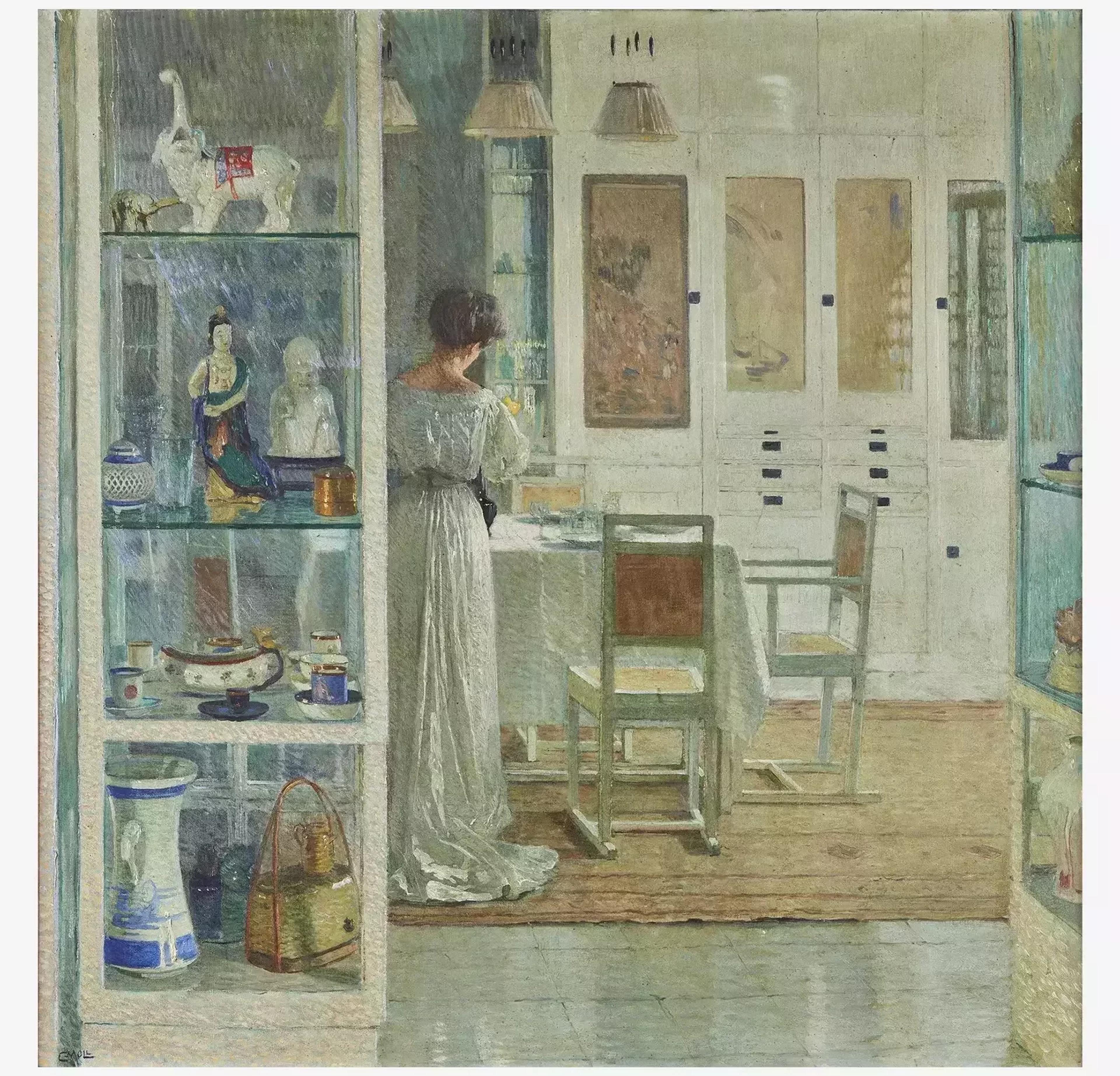
Carl Moll's Weißes Interieur Breaks Records A major work by Viennese artist Carl Moll resurfaced in 2021 after being unseen for over a hundred years. In February of 2021, Freeman’s set a new house record when Carl Moll’s Weißes Interieur (White Interior) sold for $4.75 million—over eight times the pre-sale high estimate. This sale shattered the previous world auction record of $385,653 for a Moll piece. Beforehand, the Freeman’s house record had stood at $3.1 million, set by the 2011 sale of an important Imperial white jade seal from the Qianlong period. Carl Moll was one of the cofounders of the Vienna Secession movement, a progressive group that pushed against the conservatism of the day. Mostly known for his landscapes, Moll is also revered for his serene and elegant interior scenes. Inspired by Johannes Vermeer, Weißes Interieur is a canvas marked by a sense of domestic tranquility, via its careful balance of color and diffuse light. Executed in 1905, the work depicts a solitary female figure in the center of a highly decorated living room: Berta Zuckerkandl (née Szeps)—an important art critic and one of the most influential Jewish figures in Vienna at the turn of the twentieth century. She was a fervent supporter of modern Austrian art, which she defended in the many articles she wrote as a journalist—as well as in her Salon, where she hosted many celebrities of the time, such as fellow Secessionist Gustav Klimt and Stefan Zweig. The living room in which Zuckerkandl is depicted is the one from her very first apartment in an affluent neighborhood of Vienna. It was decorated by Vienna's then–leading architect and designer, Josef Hoffmann, and was considered by many the epitome of modern design. This is exemplified by the symphony of sleek, straight, and pure lines, and shapes visible in the canvas. In the living room, Zuckerkandl and her husband housed an important collection of East Asian art, an “exotic” taste shared by many collectors and artists of the time. In early 1905, Weißes Interieur was exhibited in Berlin, and again at the Folkwang Museum in Essen in 1906. Its last public appearance—before its sale at Freeman’s—was at Vienna’s celebrated Kunstschau in 1908, where it was featured alongside Klimt’s iconic The Kiss. After this exhibition, the work remained within the same family, who moved from Germany to the United States in the mid-1970s. To mark its reappearance on the market, the painting was offered at a pre-sale estimate of $300,000–500,000—one of the highest figures ever attached to a work by Moll at auction.
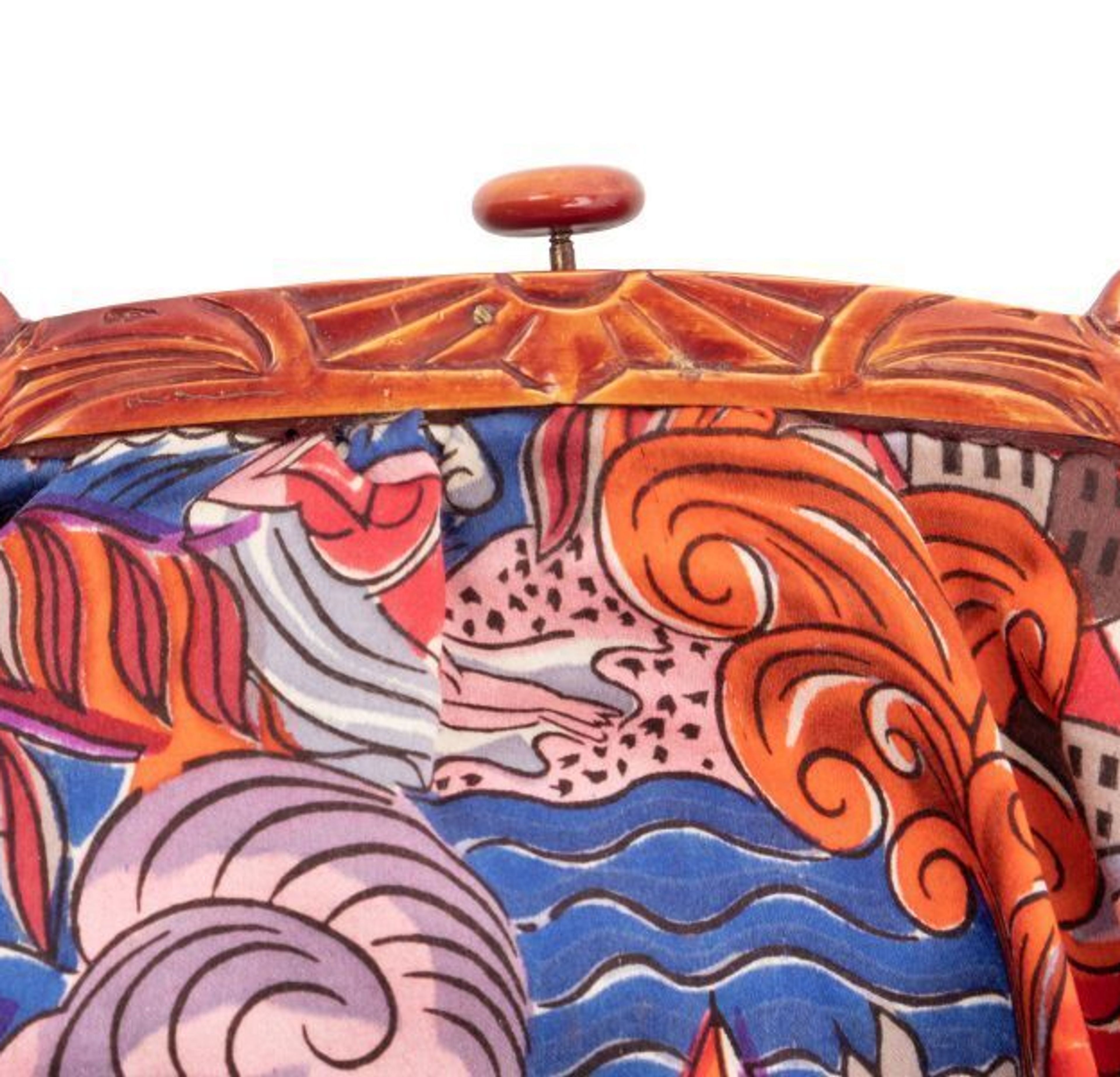
Born in Le Havre, France in 1877, Raoul Dufy made his career imbuing his Fauvist tendencies into painting, textiles, and decorative arts. His artistic practice was characterized by sanguine colors and graphic patterns, inspired by and developed through a series of relationships with influential makers of the twentieth century. It was a 1905 encounter with Henri Matisse’s Luxe, Calme et Volupté that sparked Dufy’s experimentations in color and line, which gave to his work a dreamlike quality for which he became known. Initially reproached by his contemporaries, Dufy’s work was dismissed as merely decorative and apolitical. However, it was precisely this joyful insouciance and mastery of diverse media that enabled his success in the decorative arts. Dufy’s colorful, immersive painting style translated well into printmaking, and earned him ongoing commissions by Paul Poiret beginning in 1910. The couturier believed in the unity of art and fashion, and became a patron and collaborator of Dufy’s, a relationship which would have a profound impact on the artist. Together they would open La petite usine, a woodblock printing factory in Paris where Dufy began some of his most formative explorations in textile design. He soon entered into a contract with textile manufacturer Bianchini-Férier in 1912, and continued to work with the firm for two decades. Through these collaborations, he developed his technical skills in woodblock printing and textile dyeing, and came to appreciate the possibilities of textiles. Thanks to Poiret and Bianchini-Férier, Dufy said, he found a practical application for his “axiom” of light and color, and that on silk, they could achieve melodic harmony.[1] Lot 35, Raoul Dufy “Deauville” Silk Fabric Bag, 1925 Lot 35 in Hindman’s Luxe Holiday sale features a handbag of printed silk by Dufy for Bianchini-Férier. Dated 1925, it depicts an abstracted scene of Deauville, a cosmopolitan resort town on the Norman coast. In vivid blues, orange and red, figures participate in maritime activities, surrounded by waves, quaint buildings, and sea creatures. The flattened plane abstracts the scene and gives it a fantastical air. Its clasp, likely bakelite, is decorated with Egyptianesque imagery, including symmetrical falcon-like creatures, perhaps representing Horus. The bag’s allusion to ancient Egypt was fashionable at this moment: created just two years after the discovery of Tutankhamun’s tomb, there was an appetite in popular culture for Egyptian antiquity. Lot 35, Raoul Dufy “Deauville” Silk Fabric Bag, 1925 Dufy designed this textile while travelling frequently around the Mediterranean, a joyful period amid the world’s unsettled conditions. Following the destruction of World War I, his work brought a welcome levity to visual culture. He rejected the rigidities of Art Deco and enlivened his work through vivid color and exotic locales. In this bag, the allure of escapism and vivid color are joined with the solidity of antiquity in playful juxtaposition. The reasons for which Dufy was criticized were precisely his strength, resulting in a decorative vision perfectly suited to fashion. Over the following decades, Dufy would earn his appreciation; his work was later described in Vogue, “celebrating freedom, caprice, love, joy, Dufy flatters our capacity to savor the sweet life — a flattery somewhat resistible in painting, perhaps; but stitch it into silk and ‘goodbye, melancholy.’”[2] [1] Dufy, Raoul, La Passion des Tissus (Paris: Klincksieck, 1993) [2] Schjeldahl, Peter, “The Illicit Joy of Dufy,” Vogue (New York, Nov. 1984), p. 454-457.
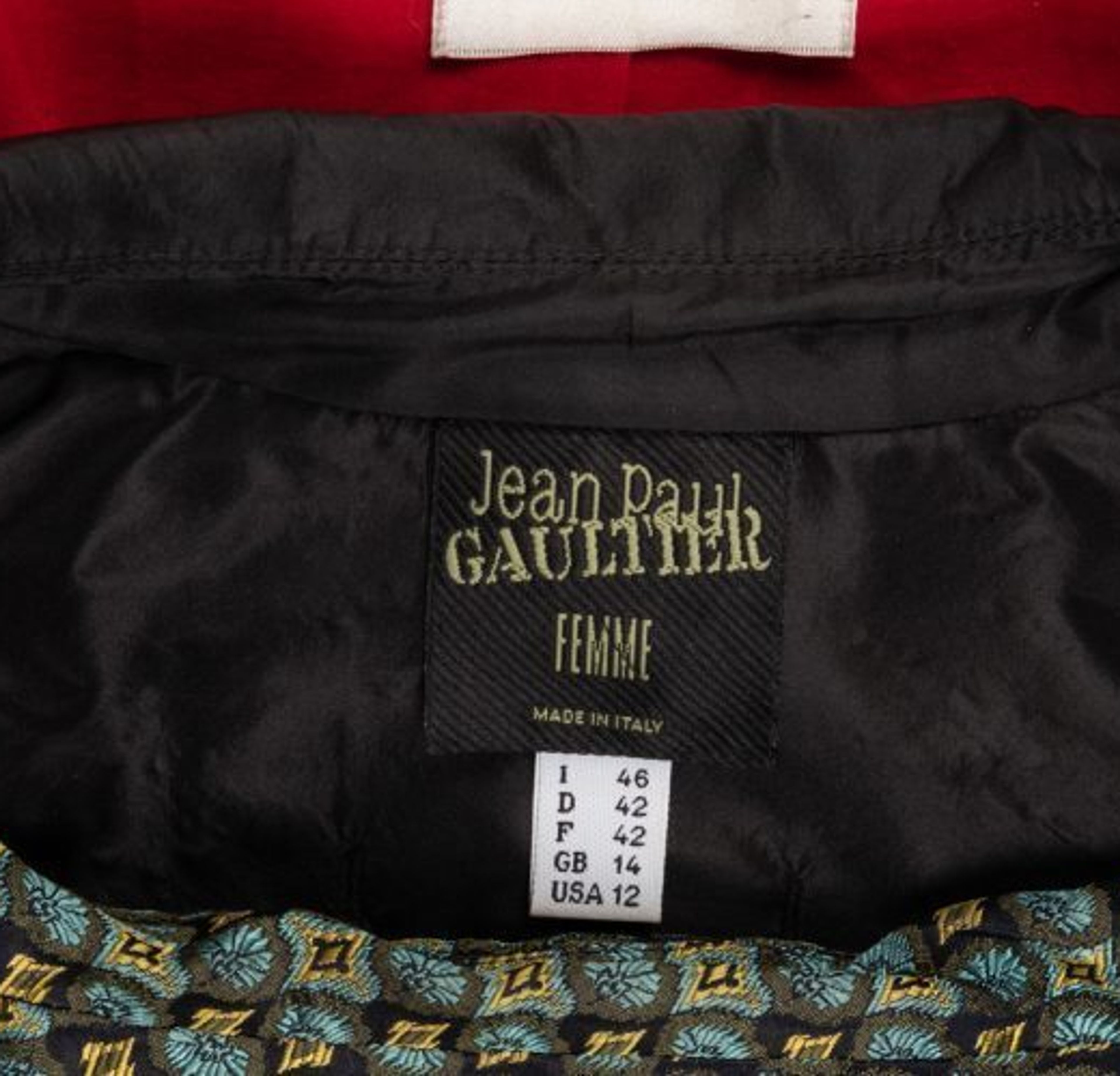
Lauded as “the first to blow a raspberry at the Paris fashion establishment,” Jean Paul Gaultier’s experimentations in couture have provoked shock, delight, and, at times, horror in the minds of his audiences.[1] Iconoclast and provocateur, Gaultier earned his reputation when he entered the mainstream in the early 1980s. His collections during this decade were among his boldest, mining the history of fashion and contemporary dress codes to challenge long standing social mores. He debuted designs that have since become mainstays of his oeuvre, introducing cone-shaped bras, skirts and corsets for men, and underwear-as-outerwear, setting the stage for a forty-year career in which he has playfully defied and rewritten the rules of Parisian couture. Lot 167, Collection of Three Designer Jackets and Coats, 1998-2006 Gaultier’s enduring interest in the corset began during his youth when he would spend time with his grandmother, learning about the lacing and reshaping of the feminine form. For him, the corset evoked “something extraordinary, fascinating and mysterious.”[2] This early exposure influenced his later reintroduction of elements of corsetry to his runway fashion. Though it had fallen out of favor in the late 1960s during the women’s liberation movement, Gaultier was interested in the corset’s potential to represent strength and empowerment. Lot 167 includes a 1998 Jean Paul Gaultier women’s jacket featuring seam detailing on the exterior to resemble boning. The silhouette makes reference to Christian Dior’s New Look debuted in 1947, but in its exposure of the “boning,” becomes skeletal and powerful.Gaultier’s use of such visual elements helped to change the associations of corsetry in popular culture, a transformation that, thanks to his collaboration with Madonna from 1990 onward, took place on the world stage. Lot 167, Collection of Three Designer Jackets and Coats, 1998-2006 Lot 177 features a men’s jacket from Gaultier’s spring/summer 1989 collection, with cutouts at the waist forming a corset, and lacing up the back. As the corset enabled Gaultier to explore femininity, so too does he use it to challenge masculinity. “He has played a crucial role in the redefinition of ‘woman’—and also ‘man’—in fashion,” writes fashion historian and curator Valerie Steele. “His is a very constructed approach. In it, the beauty ideal is denaturalized and can be seen to be artificial, a construction of masculinity and femininity, coolness or youth, but Gaultier shows the seams to indicate how it has been done.”[3] These jackets reveal the structure of the corsets so central to Gaultier’s work, and in doing so, introduce something playful to what fashion holds most elemental. Lot 177, Three Jean Paul Gaultier Pieces; Two Jackets, One Vest, 1990s Hindman is pleased to offer these garments, among others, by Jean Paul Gaultier in the Luxe Holiday: A Collectors’ Collection auction on December 11th. [1] This, and title, from “Jean Paul Gaultier: Enfant terrible of haute couture” in The Observer, 17 Oct. 1993 [2] Florence Müller, ‘Gaul’tier by Jean Paul’ in The Fashion World of Jean Paul Gaultier: From The Sidewalk to the Catwalk, ed. Thierry-Maxime Loriot (Montreal, 2011)p. 27 [3] Valerie Steele in The Fashion World, p. 153.
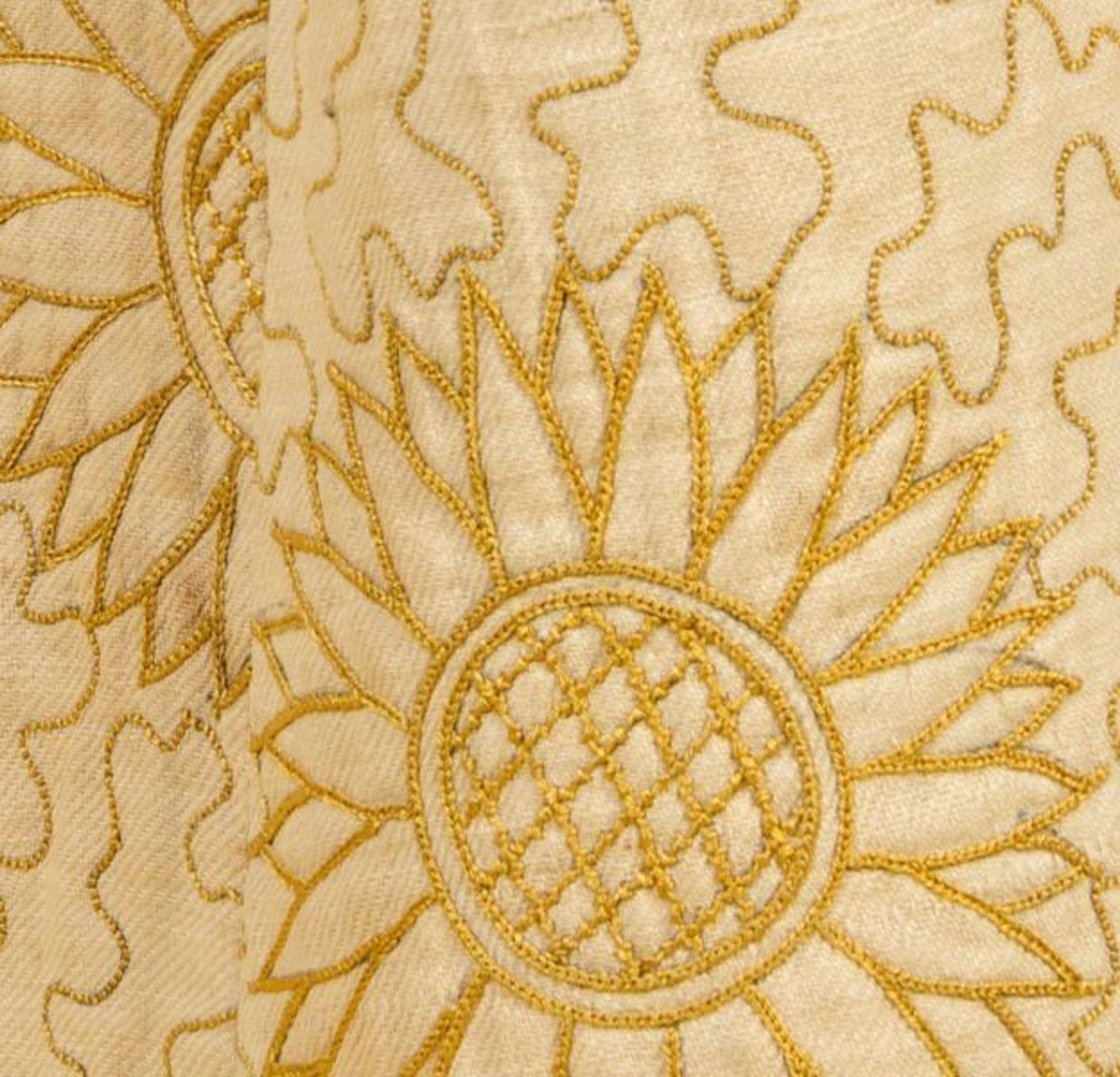
Against modernity and beholden to it, the Aesthetic movement of the late 19th century rebelled against the machine age and the “ugliness” of contemporary Victorian life. The movement privileged art for art’s sake, seeking to beautify all things, and plundered history for inspiration. Preeminent aesthete Oscar Wilde is known to have said, “What is beautiful looks always new and always delightful, and can no more become old-fashioned than a flower can.”[1] Indeed, his pronouncements on fashions and design influenced clothing trends throughout Europe and the United States. Lot 89, from the Mary D. Doering Archive, is an exquisite example of Aesthetic sensibilities in fashionable women’s dress. Embroidered with stylized yellow sunflowers and vines on white cotton twill, this wrapper (c. 1880) would likely have been worn informally as a housecoat or tea gown. It features a Watteau-pleat back which is held in place by a golden-yellow belt. This style was appropriated from the sacque dresses of the previous century, illustrated in the works of Watteau. Though this garment may have been worn with a corset, Watteau pleats were favored by Aesthetes for their ability to give a more naturalistic curve to the body. Corsets became a contested theme during this period: dominant Victorian silhouettes were shaped and molded, while aesthetes preferred styles inspired by Greco-Roman antiquity. To this, critics said, “had Venus herself been compelled by a cold climate to drape herself, we have little doubt she would have worn stays, to give her clothes the shape they lacked.”[2] The gentle slope of the Watteau back and delicate floral embroidery create a soft beauty in contrast to the more severe Victorian style. The origin of the Aesthetes’ appropriation of the sunflower is unknown, though the motif eventually became “the floral emblem of an aesthetic sensibility.”[3] Its resplendent shade was one that had been reviled as a signifier of shame or decay: in the West, yellow had long been the victim of chromatic denigration, from its association with opium dens in the Far East, Dickensian descriptions of sallow flesh, and sexual impropriety. For this very reason, it became central to Aesthetic style, for the movement embraced that which was subversive to dominant English culture. “The very act of declaring a color as unacceptable, antisocial, and unsuitable makes it irresistible to those who consider themselves outside of conventional society, and oblivious to orthodoxy’s strictures,” writes Jonathan Faiers. “Yellow’s popular perception as the color of shame, perversity, and an artistic sensibility so refined as to be ‘unhealthy,’ meant that toward the close of the nineteenth century the color entered into an epistemic contract (as did the color green) with what would latterly become known as the Aesthetic Movement, simultaneously linked to and identifying yellow as a color beyond the pale.”[4] Green and yellow became so linked to the Aesthetic sensibility that upon the opening of the Grosvenor Gallery, known as the movement’s “home,” it was mocked with the line, “Greenery, yallery Grosvenor Gallery.” In centuries prior, however, these shades had been associated with “Venus, felicity, and pleasure,” and so the sunflower’s vibrant hue made it a fitting symbol for the Aesthetes’ decadence.[5] It, along with the lily, was a favorite of Wilde’s: “It is because these two lovely flowers are in England the two most perfect models of design, the most naturally adapted for decorative art—the gaudy leonine beauty of the one and the precious loveliness of the other giving to the artist the most entire and perfect joy.”[6] His assertion of its simple beauty and perfection by design point to the sunflower’s popularity in textiles and interior decoration. Aesthetic philosophy dictated that the home, and all contained within it, should be designed completely and exquisitely. Wilde’s 1882 “House Beautiful” lecture given in Chicago proposed that dress and interior space should be harmonious. Women, as domestic creatures, were advised to dress to match their homes. A critic of contemporary fashion, Mrs. Eliza Haweis wrote in 1878 that, “A great change has come over the style of English dressing within the last, say, five years. The world of artists first started the idea of their wives and daughters dressing in harmony with [their] surroundings, and thence the grandes dames of fashion were influenced.”[7] Elements of aesthetic and artistic dress continued to enter the mainstream over the next decade, and this holistic approach to fashion and design was particularly attractive to wealthy American women. They listened attentively to Wilde’s lectures, and eagerly implemented these philosophies to display their husbands’ prosperity through the making of a beautiful home. In this dress, the embroidered chain stitches create the ground of an intentionally anti-modern silhouette. A woman, wearing this garment to receive her guests for tea, would have fit the Aesthetic ideal, achieving harmony between dress and interior space. These yellow sunflowers in their chromatic decadence embody Wilde’s maxim that “beautiful surroundings” should not be “marred” by “gloomy dress.”[8] Hindman is thrilled to present lot 89 among three centuries of historical dress from the Mary D. Doering Archive in Luxe Holiday: A Collectors’ Collection on December 11th [1] Wilde, Oscar, “The Philosophy of Dress,” New-York Tribune, 19 April 1885. [2] Douglas, J., The Gentlewoman’s Book of Dress (London: Henry and Company, 1895) p. 123-124. [3] Faiers, Jonathan, “Yellow is the New Red, Or Clothing the Recession and How the Shade of Shame Became Chic,” in Colors in Fashion, eds. Jonathan Faiers and Mary Westerman Bulgarella (London: Bloomsbury Academic, 2018) p. 95-106. [4] Ibid. [5] McNeil, Peter. “Fashion, Dress, and Interior Spaces,” in Berg Encyclopedia of World Dress and Fashion: Global Perspectives, eds. Joanne B. Eicher and Phyllis G. Tortora (Oxford: Berg, 2010) p. 218–225. [6] Oscar Wilde quoted in Ransome, Arthur, Oscar Wilde, A Critical Study (London: Methuen & Co., 1923) p. 69. [7] The Queen (24 August 1878) p. 139-140, cited in Cullen, Oriole. “Aesthetic Dress.” The Berg Companion to Fashion, ed. Valerie Steele (Oxford: Bloomsbury Academic, 2010). [8] O’Brien, K. H. F., “‘The House Beautiful’: A reconstruction of Oscar Wilde’s American Lecture,” Victorian Studies 17, no. 4 (1974), p. 414.